The Challenge
The client had dedicated thirty years to the study of Tibetan medicine and the cultivation of hand-picked wild herbs. The task was to create a brand that simultaneously reflects the depth of Eastern philosophy and the clarity of Western methodology — and that works in the practical reality of a pharmacy, where communication needs to be simple and immediate.
Concept & Solution
The name TO SU TE was built on two layers of logic. In Croatian, it speaks plainly: look no further, no doubt about it, these are the ones that work — because these are precisely THOSE. Short, memorable, with trust built directly into the name. And phonetically, the rhythm and stress of the name resonates with Eastern speech patterns — a name that operates on both cultural registers at once.
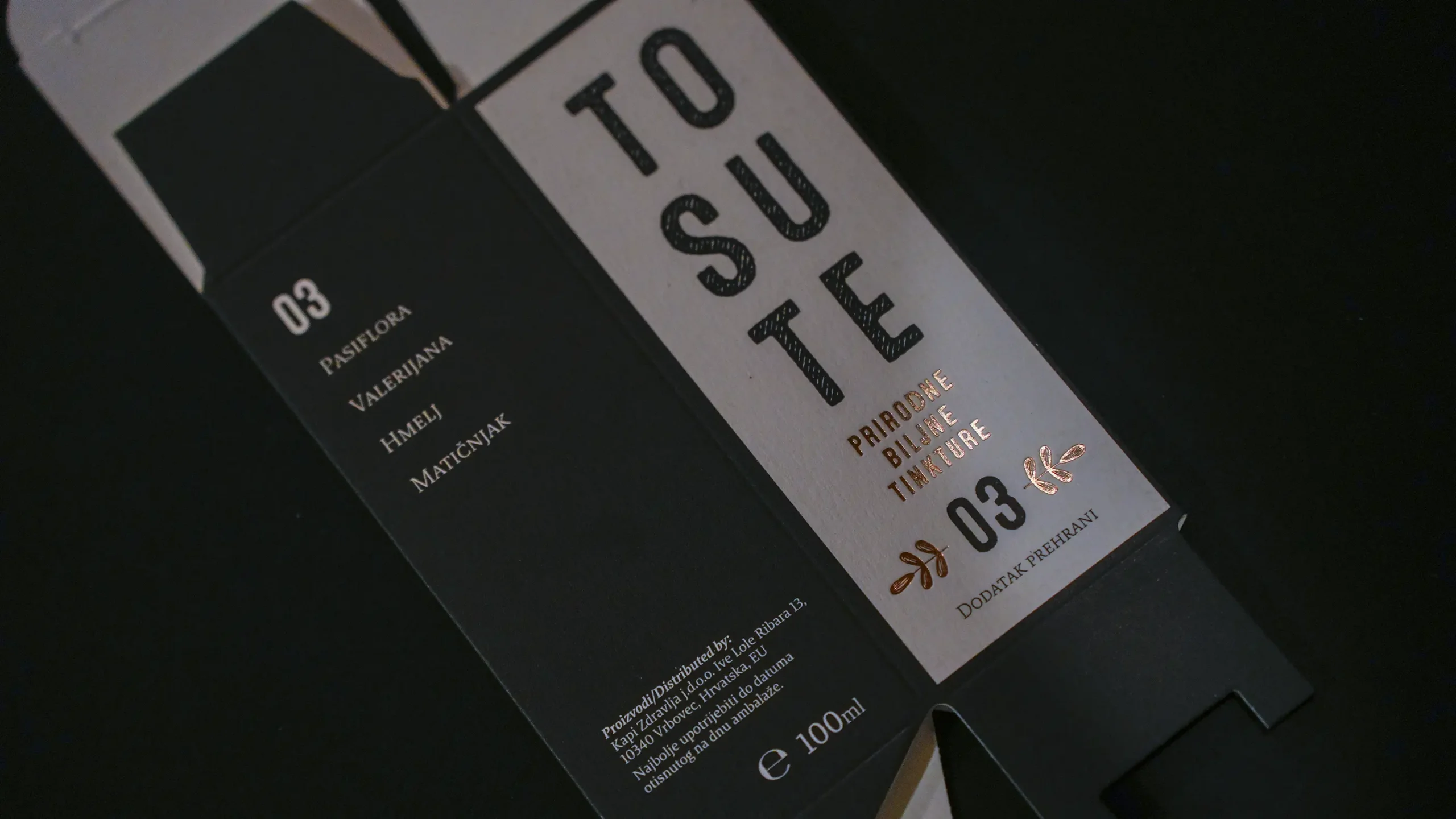
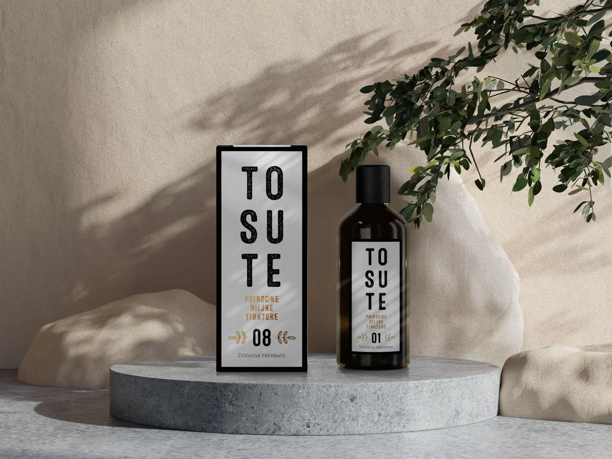
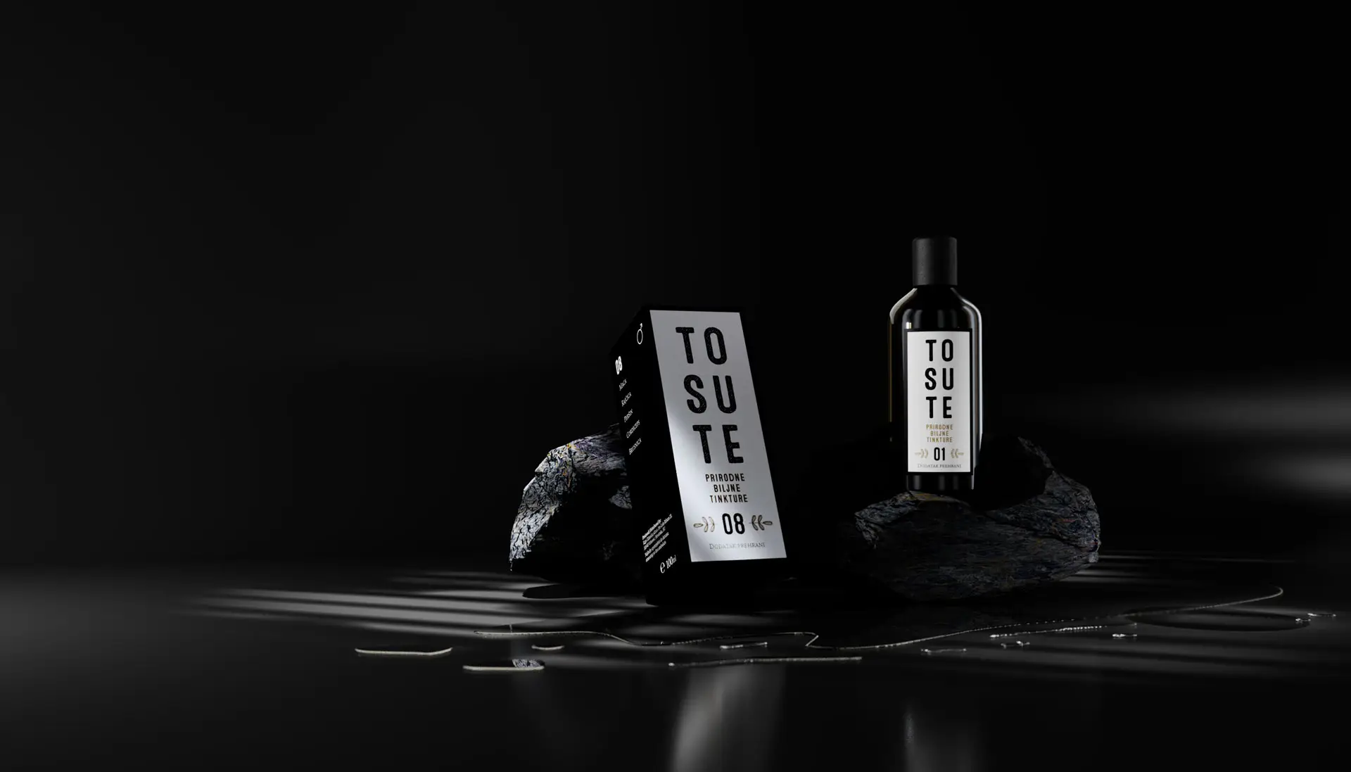
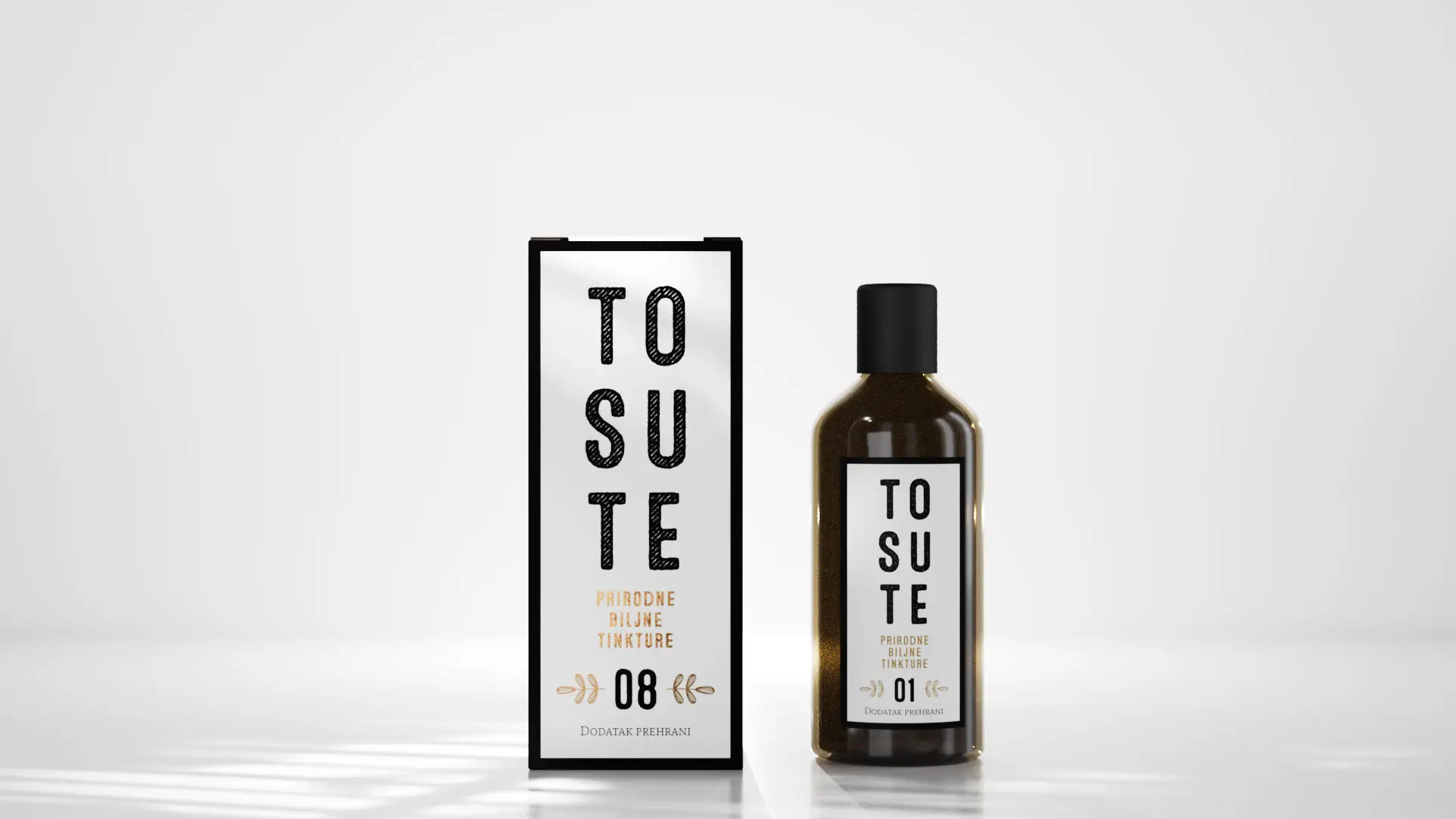
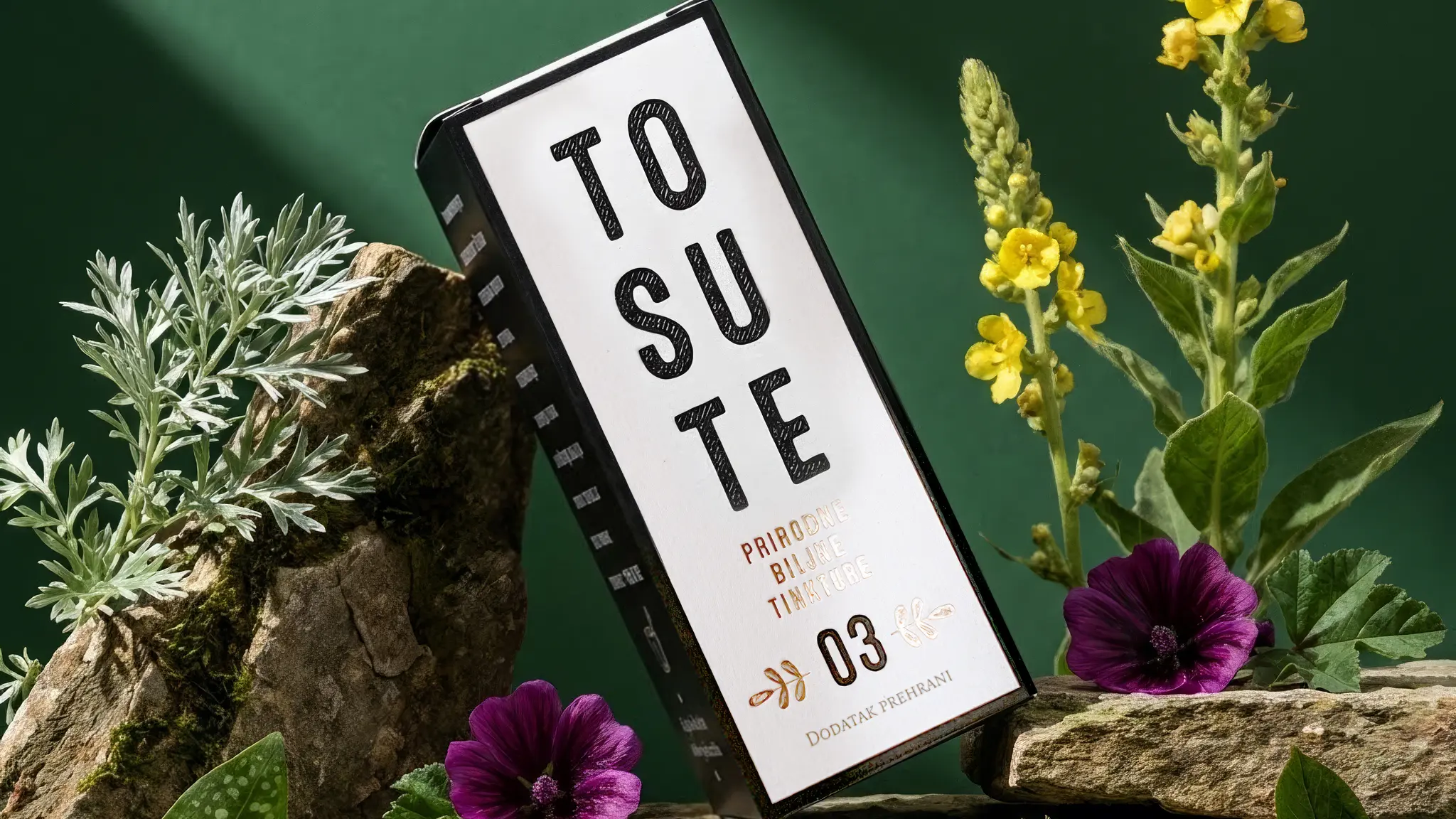
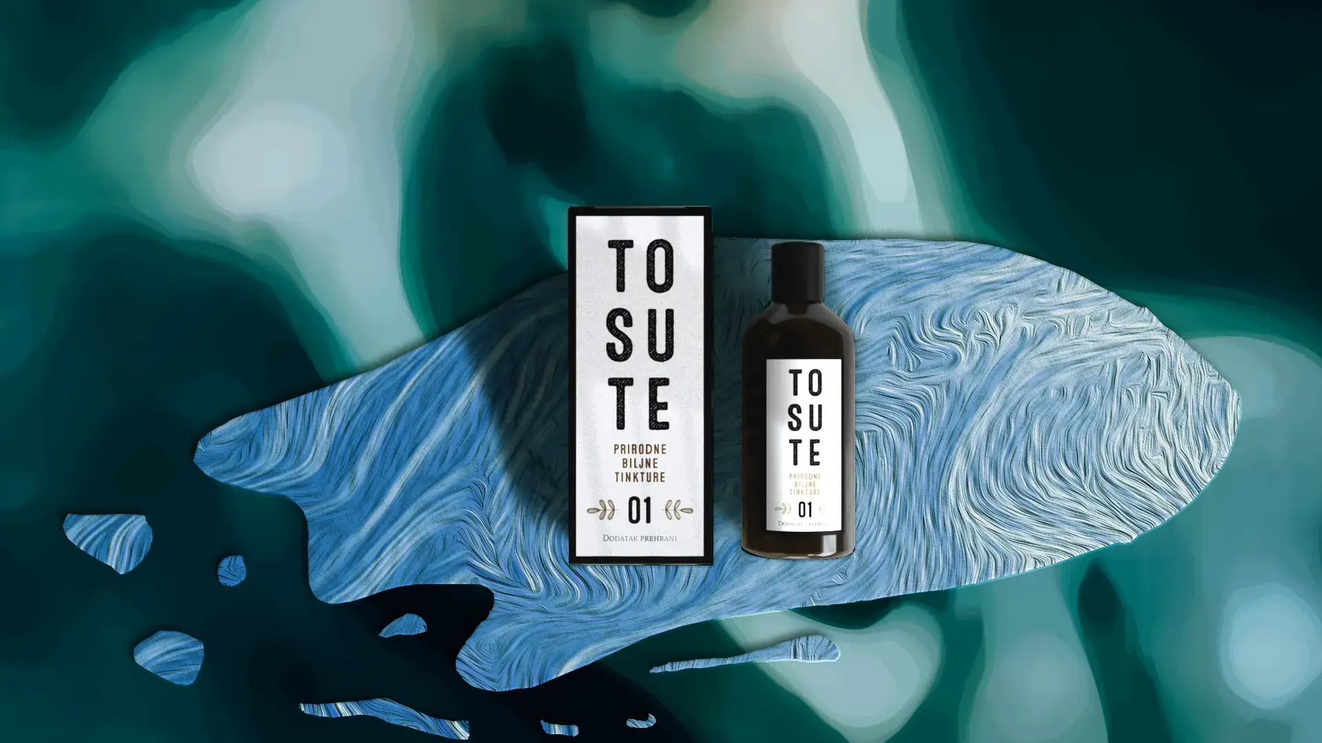
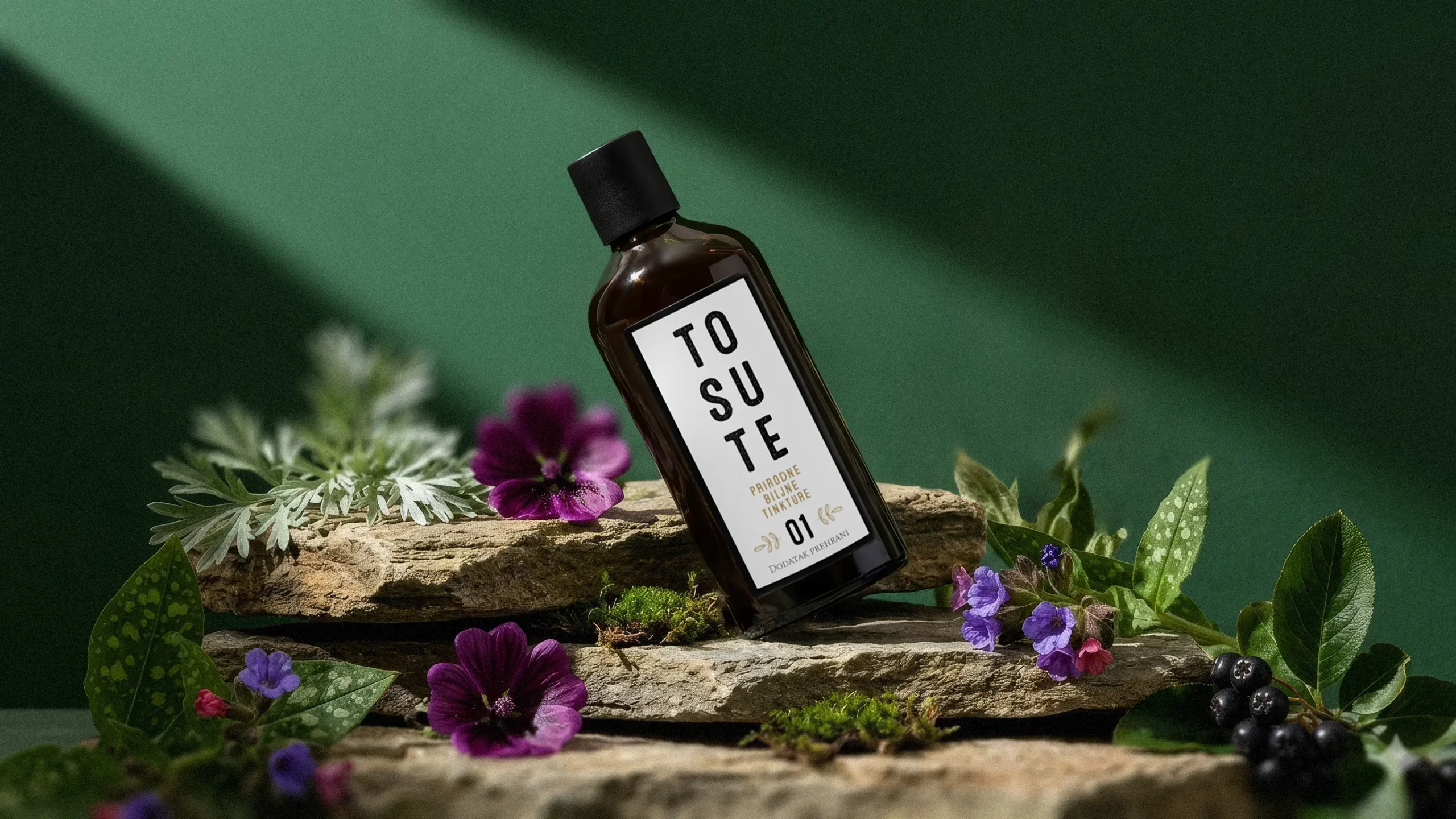
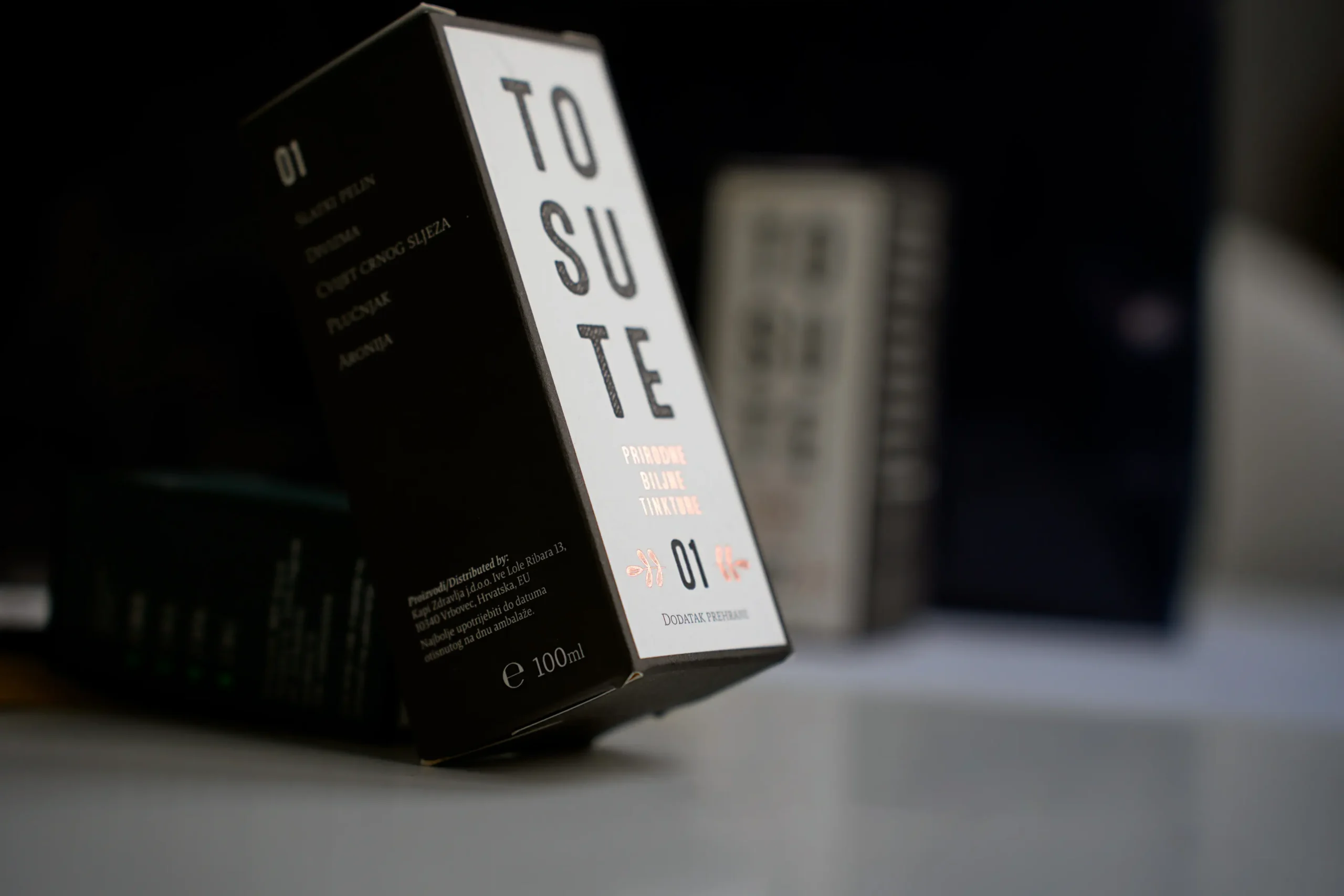
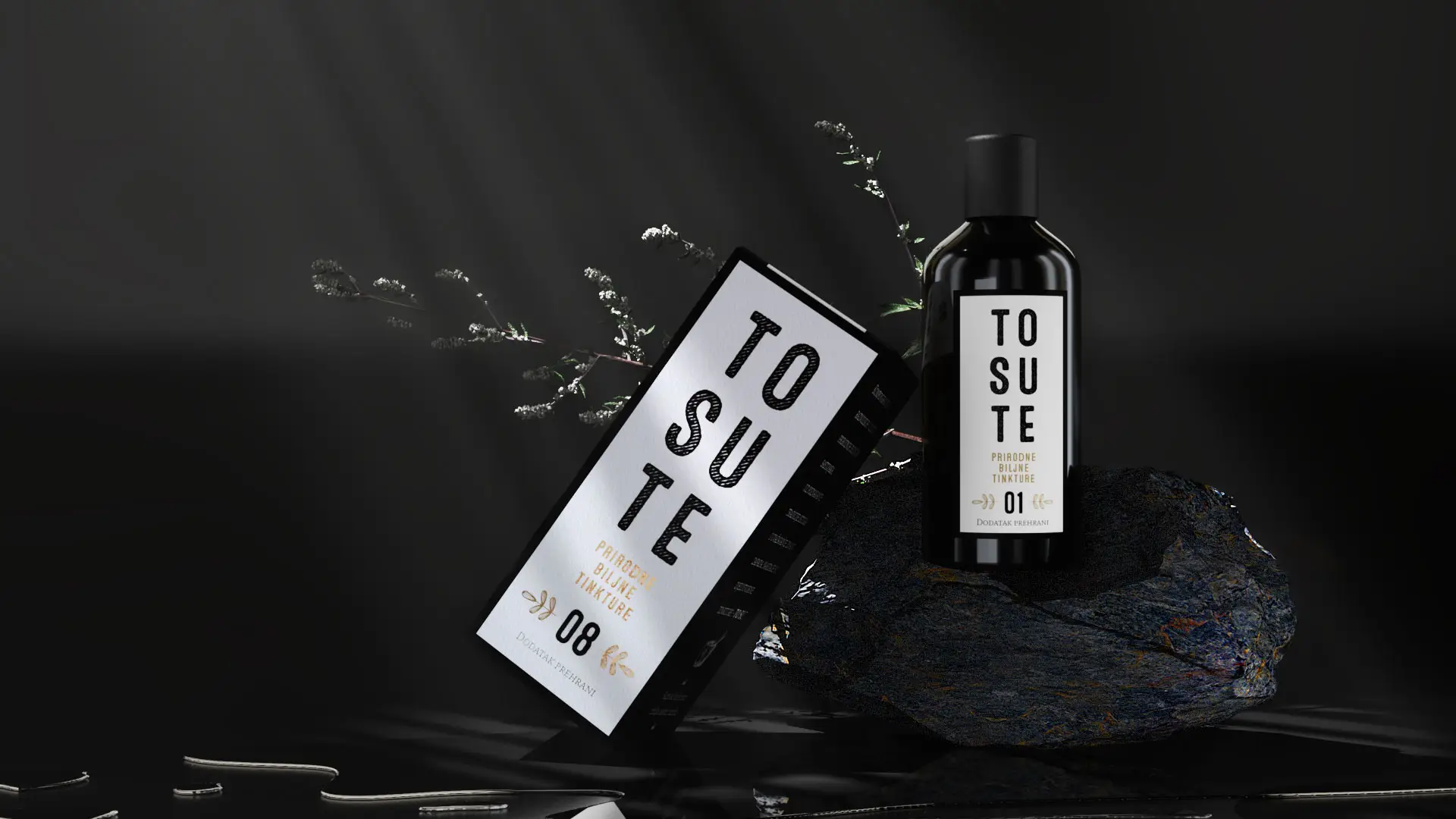
The packaging design is led by bold, clear, vertically arranged retro typography with an aged print effect and glossy copper foil — a visual signal of high value that speaks of hand-harvesting and carefully selected ingredients, without theatrics or over-explanation.
Particular attention was given to the communication system for the end user. Since the target audience is often older customers, the entire pharmacy interaction was reduced to its simplest possible form: each product carries a number, and the only thing the patient needs to remember is that number. The conversation goes something like this:
— I need something for "xy" symptoms. They told me it's number 6.
— Ah, I see — you need TO SU TE no. 6.
— Yes, that's it! (*cro.„To su te!“)
A system that eliminates confusion, lowers the barrier to purchase, and builds trust through simplicity.
The Result
A highly recognisable brand that customers experience as a product they can trust. Finding TO SU TE drops in a pharmacy is fast, clear, and stress-free. Eastern philosophy and Western precision are distilled into a name and identity that works — and that customers remember.