Forketa
Mediterranean Restaurant
The Challenge
A restaurant situated at the very heart of the Sali harbour — beside an 18th-century baroque building listed as protected cultural heritage — needed a name and visual identity to match what it offered: a blend of modern and traditional Mediterranean cuisine, outstanding gastronomy in an authentically island setting.

Concept & Solution
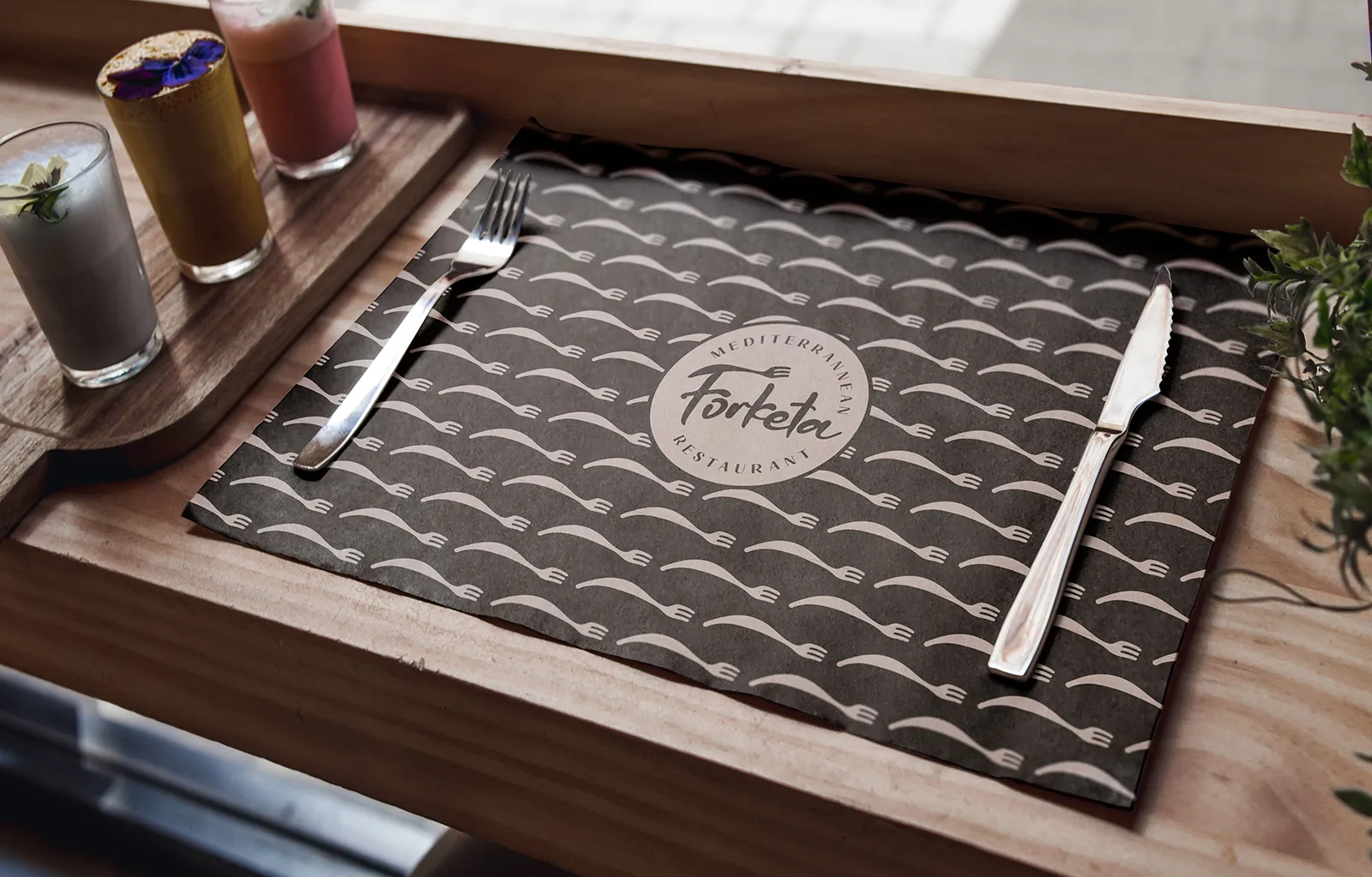
We found the name in a language that is slowly disappearing. Forketa — the local dialect word for fork, still heard among the older residents of Sali — captured exactly what we were looking for: something indigenous, island-born, and warm, while being unmistakably gastronomic in its reference.
In form, we aimed to emphasise simplicity, modernity, and a refined dining experience. The part of the logo that clearly evokes the shape of a fork also works independently — multiplied and rotated, it becomes a pattern system that references the Mediterranean in all its expressions: fish, waves, sea, sun, coastline. One element, an infinite number of stories.
Alongside the naming, logo, and graphic standards, we designed interior and exterior signage, menus, corporate stationery, staff uniforms, and promotional materials — all in harmony with the character of the place and the ambition of what it serves.
The Result
Forketa has established itself as a restaurant you must visit when on Dugi Otok. The visual identity and the restaurant's offering work in perfect synergy — guests recognise the character of the place at first glance, and confirm it with every plate.


