Ulola
Natural Cosmetics
2019
The Challenge
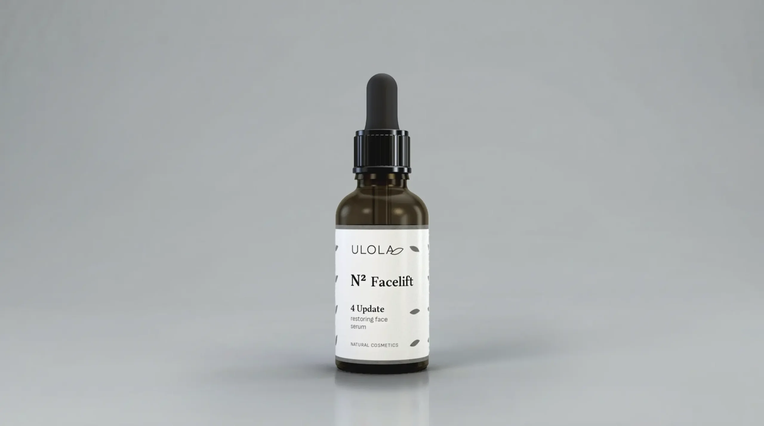
Ulola is a natural, handcrafted cosmetics brand with growth ambitions and a clear goal: to elevate its market perception from a charming small brand to a serious, premium player. The task was to develop a new visual coding system for its product lines and design packaging that could carry that positioning with confidence.

Concept & Solution
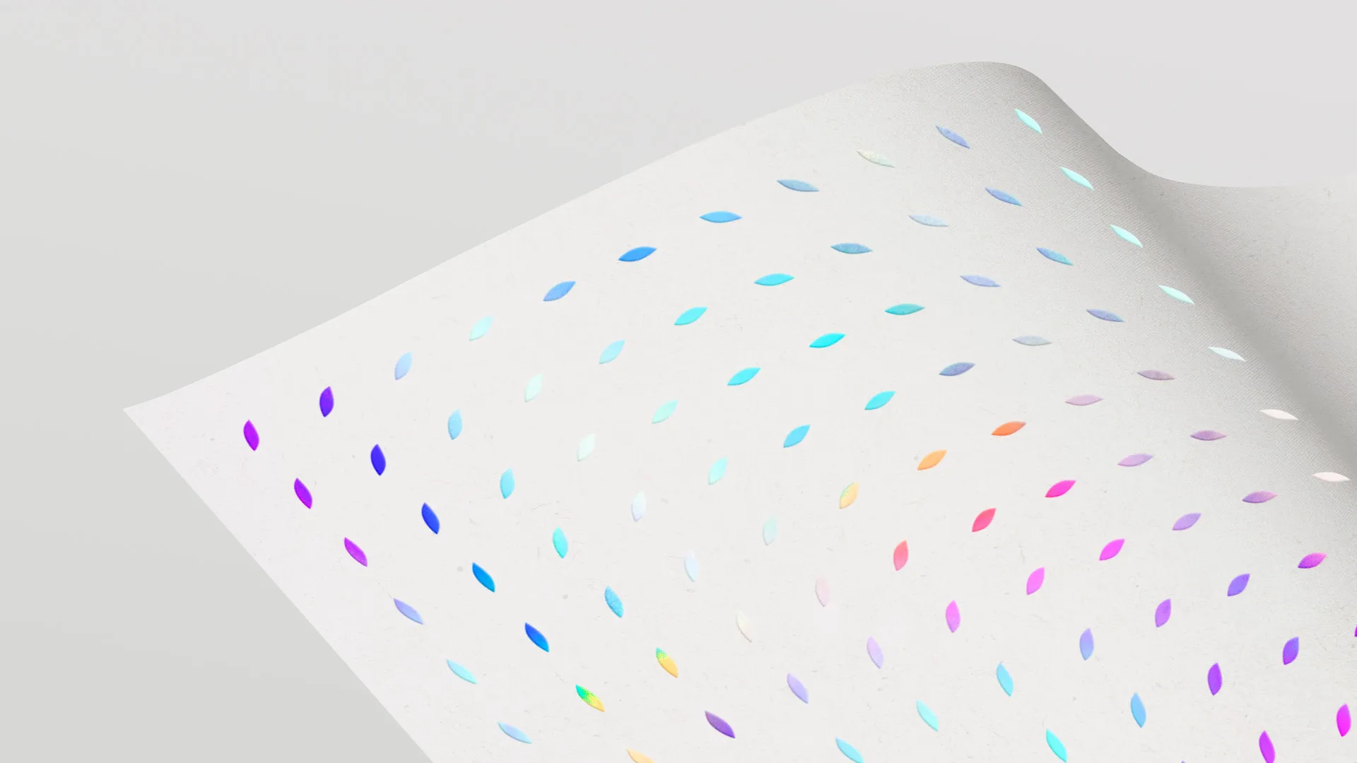
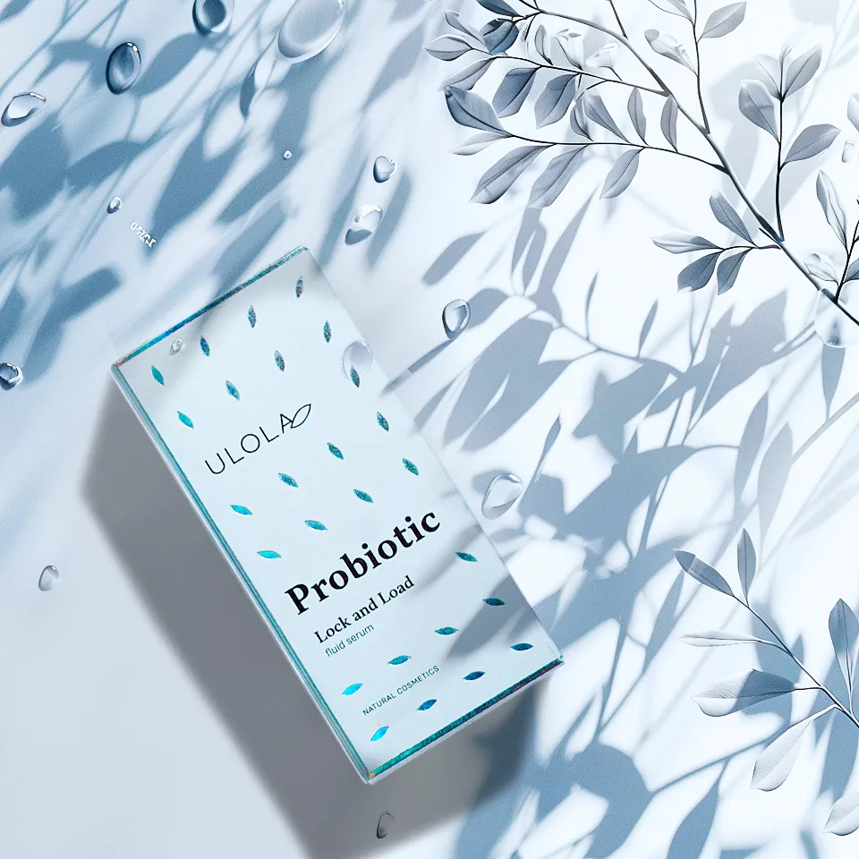
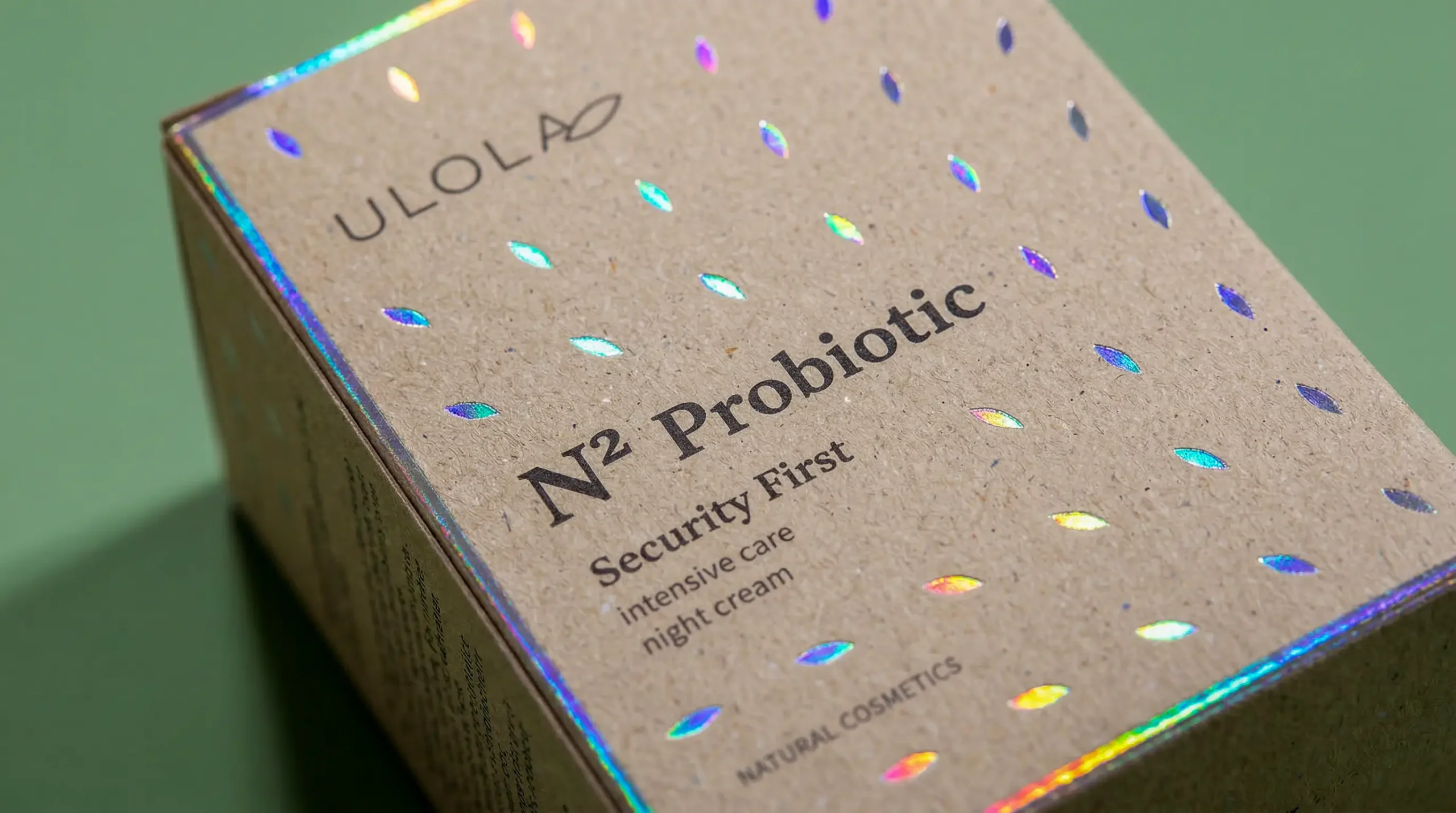
Ulola means "wave" in Sanskrit — and that motif became the backbone of the entire visual solution. The existing logo was refined to achieve greater balance and elegance, with a clean, airy feel that nods to natural ingredients and quality craftsmanship.
But the wave didn't stay as a concept — we made it physical. A geometric pattern combined with holographic and gloss foil printing creates an effect that shifts with the angle of light and the movement of the hand. When the box is held, it shimmers and ripples like gentle sunlight on water. The packaging paper was selected for its texture, referencing the natural ingredients and handmade process — a material that is not only seen, but felt.
The Result
Packaging that doesn't go unnoticed. On drugstore shelves, it shimmers and catches the eye as customers walk past — drawing attention without shouting for it. Ulola is now perceived as a high-quality, luxury brand, represented with dignity at every point of contact with the customer.