FO – Filipi oil
Premium olive oil
2022
The Challenge
The Filipi family has been growing olives on the island of Dugi Otok for generations, producing cold-pressed oil of exceptional quality. Yet their existing brand — Zlatna Kap (Golden Drop) — and its packaging failed to tell that story. The visual identity reflected neither the family's tradition, nor the product's island origins, nor its true quality. The task was straightforward: create a brand and packaging that are worthy of what's inside the bottle.
Concept & Solution
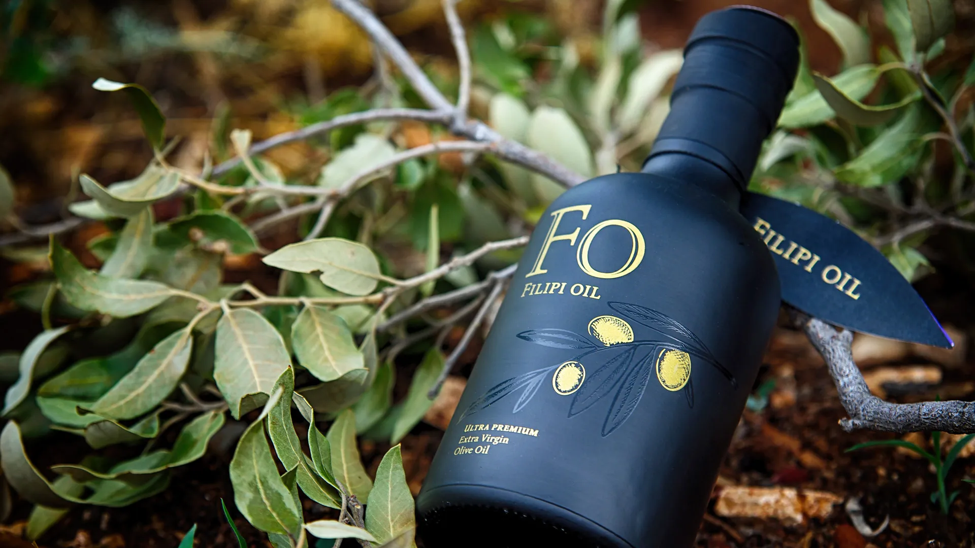
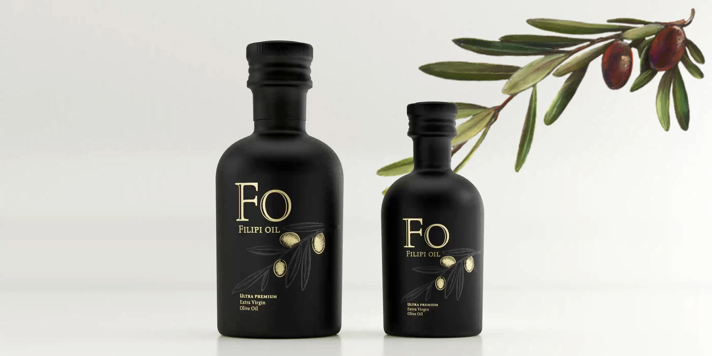
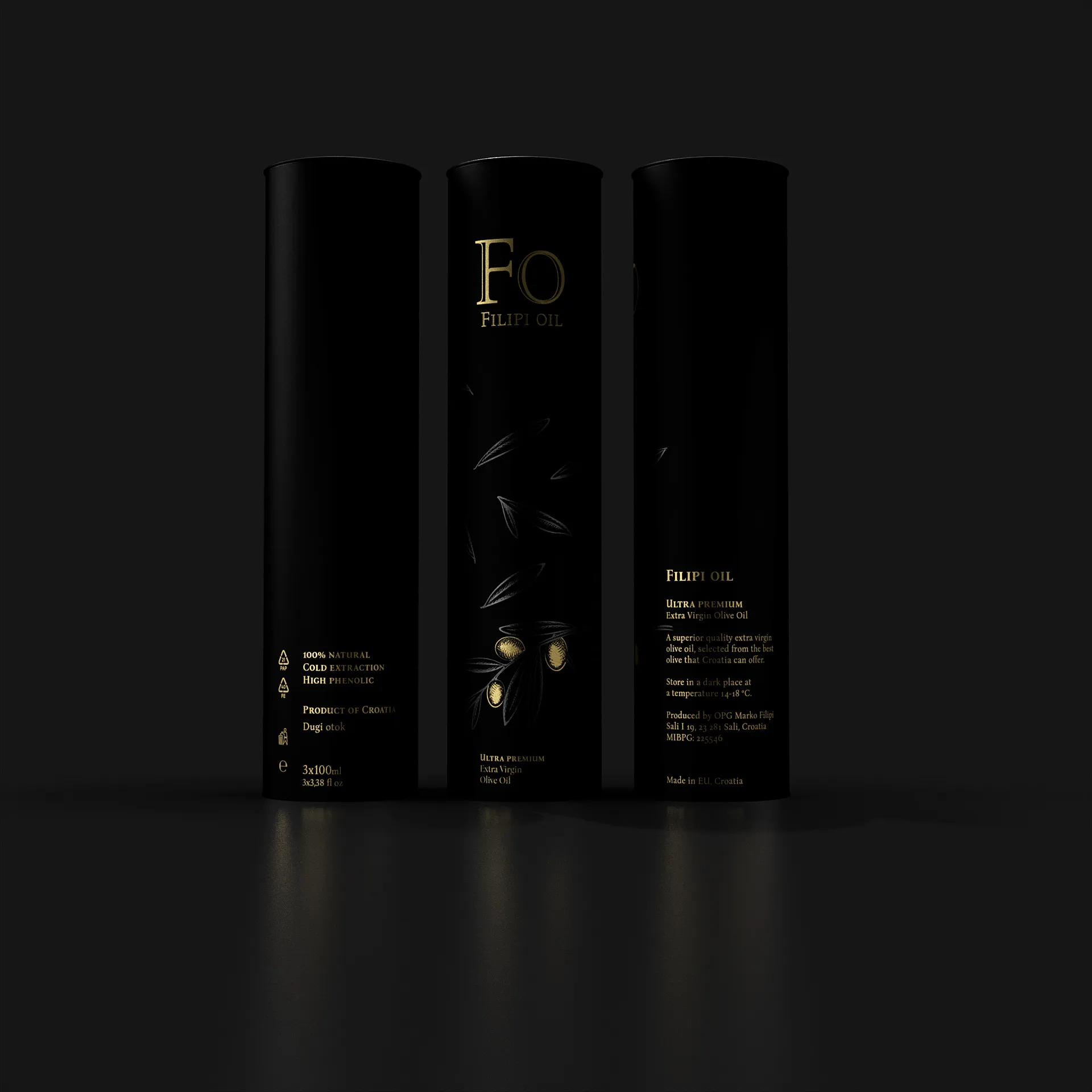
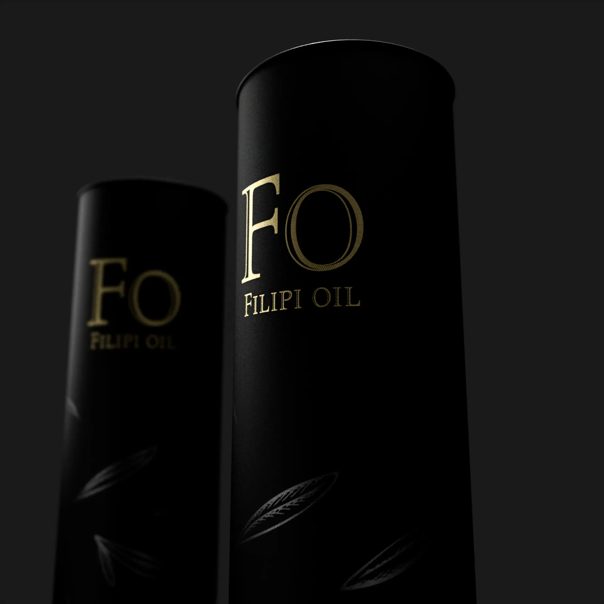
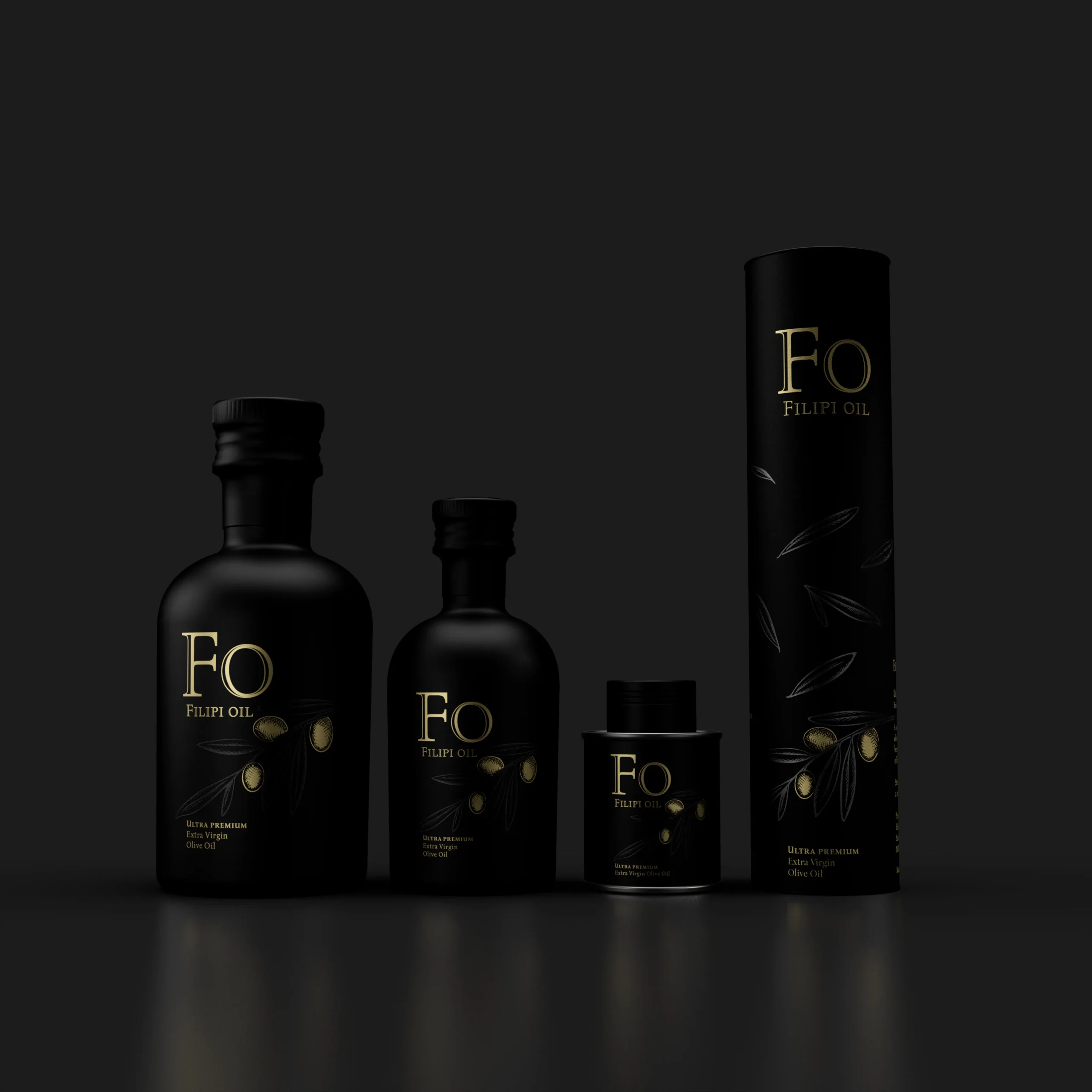
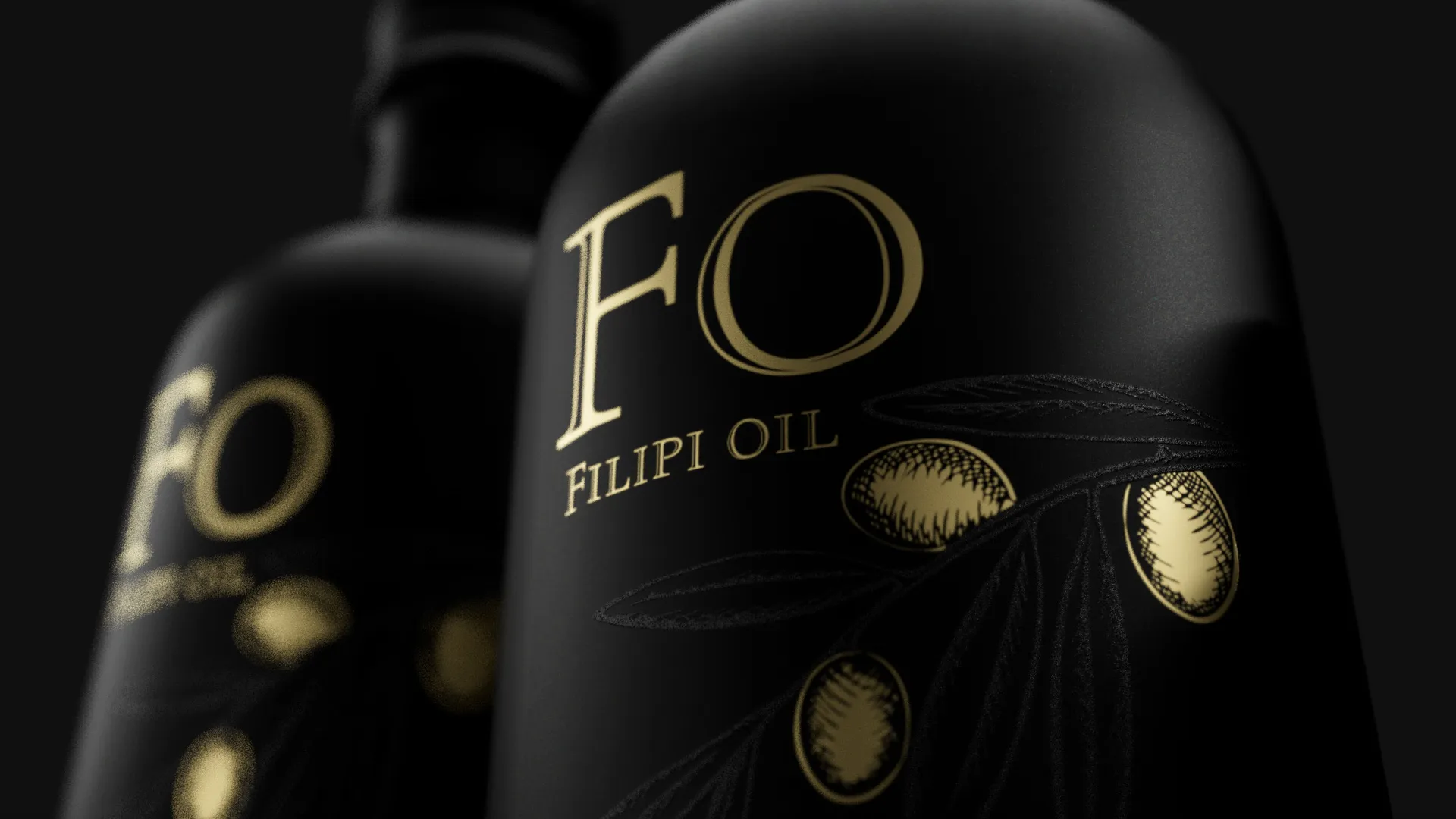
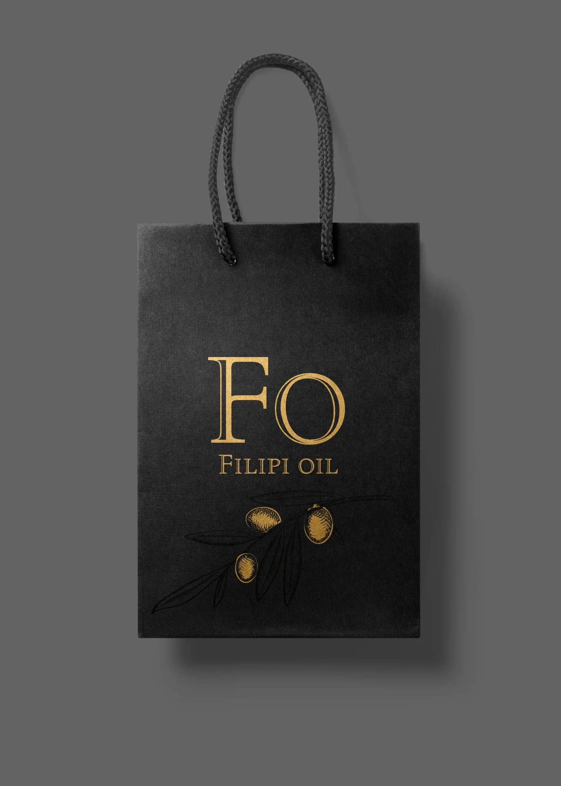
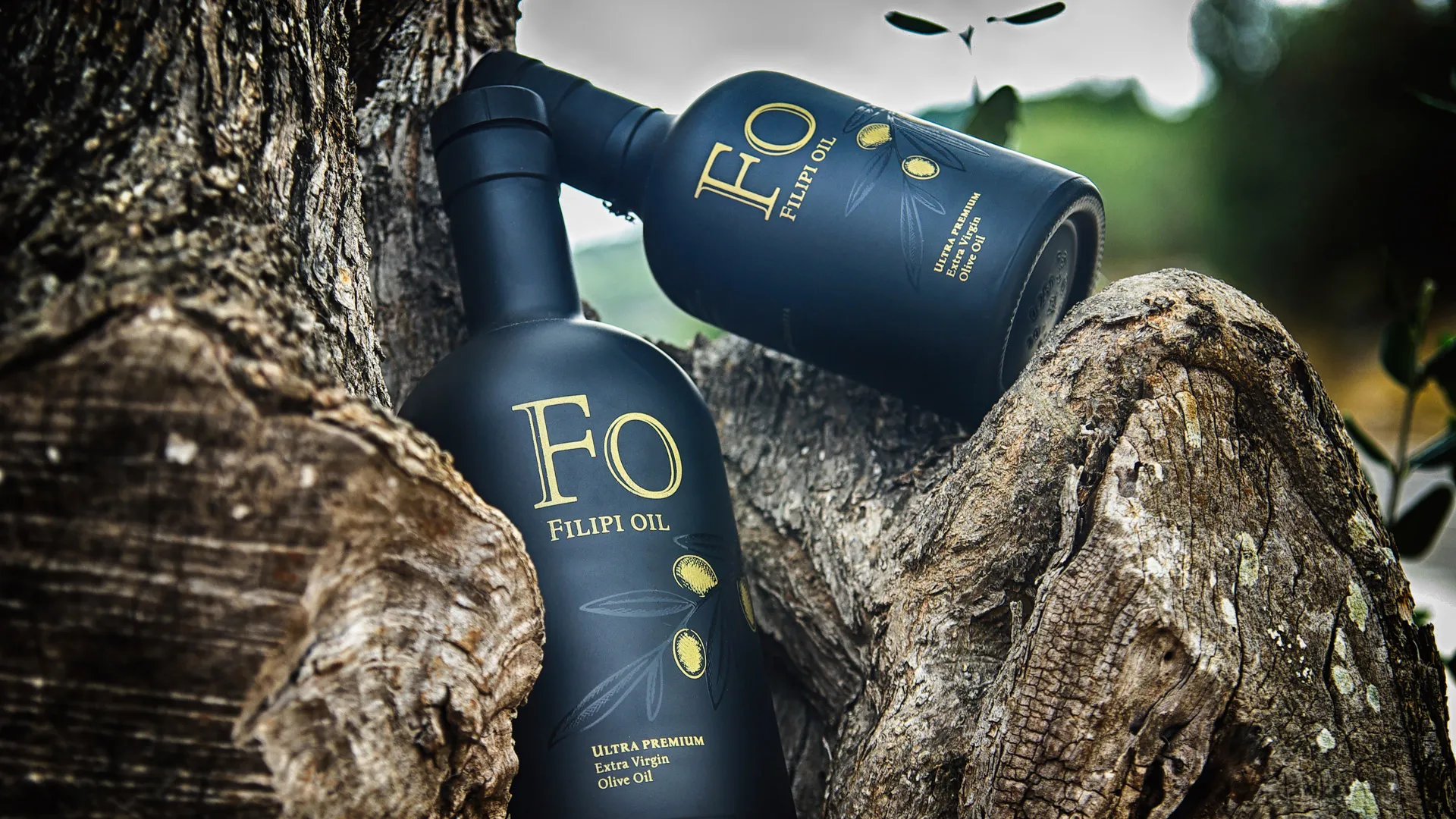
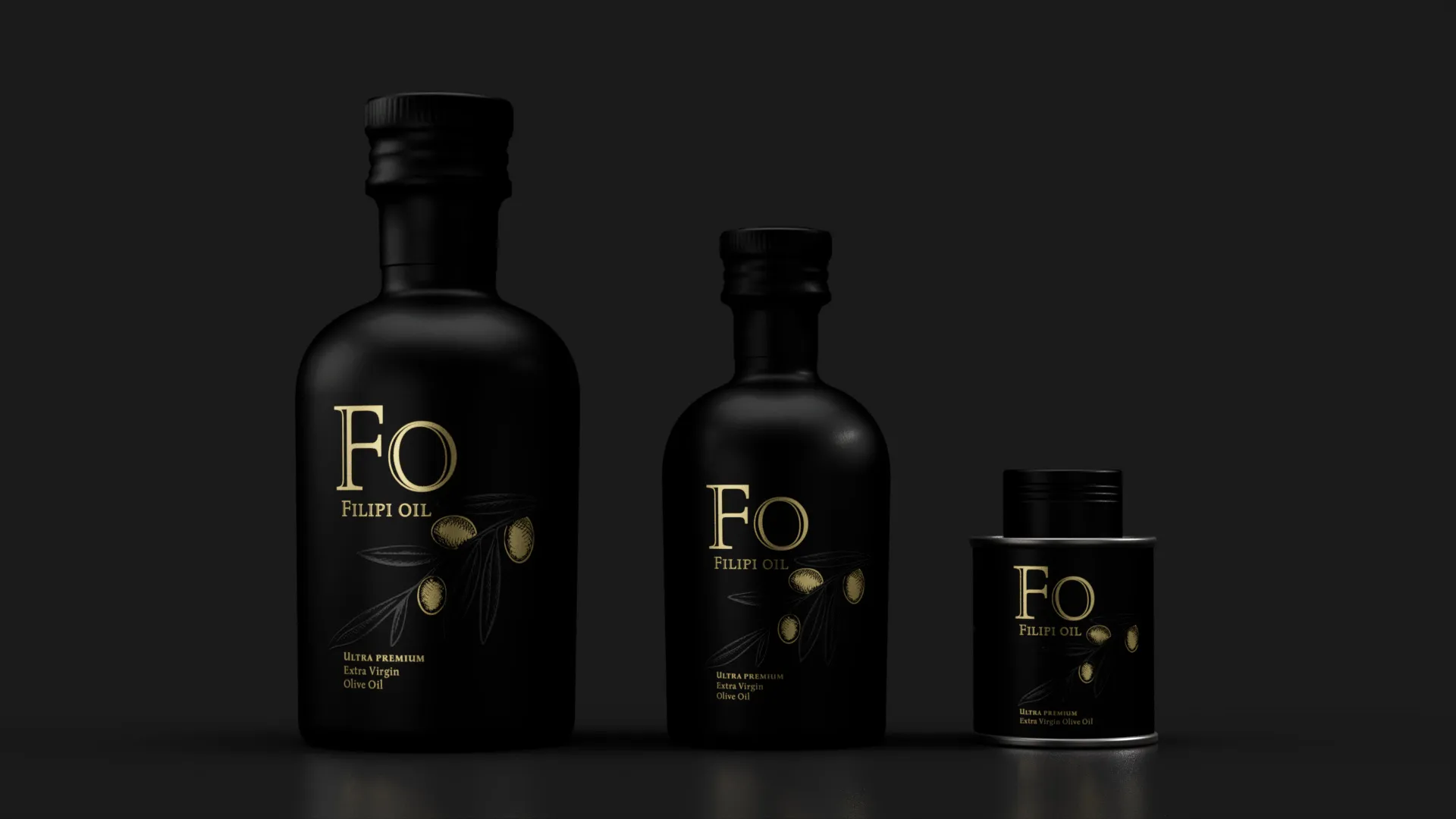
We started from the ground up — with the name. Zlatna Kap was replaced by FO – Filipi Oil, giving the brand a clear family and geographical identity. The name speaks of origin and of the people behind it.
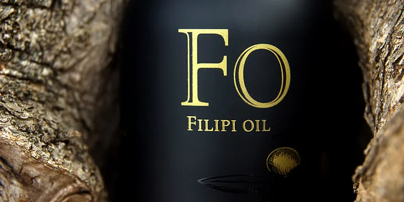
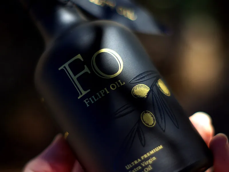
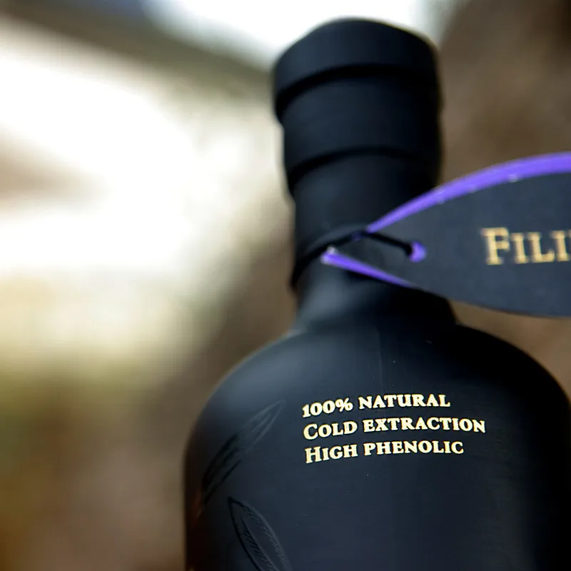
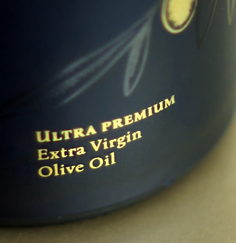
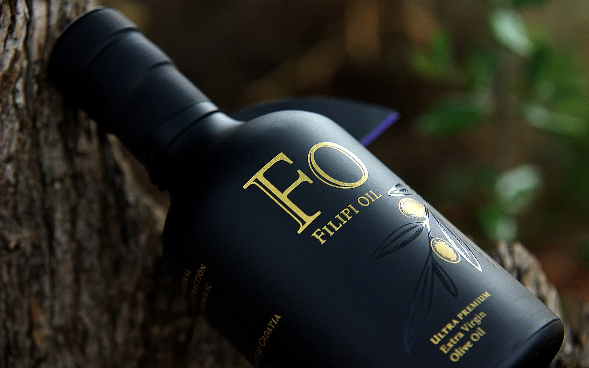
For the packaging, we chose a matte black bottle — a material that communicates sophistication on its own, while also protecting the oil from light. We applied an aged gold print effect and gloss varnish directly onto the surface — a combination that tells you immediately you're holding something exceptional. The design is completed with carefully selected typography and a minimalist approach that doesn't compete for attention with the product, but elevates it. Alongside the bottle, we designed cardboard tubes and accompanying promo materials that round out the complete brand experience.
The Result
FO – Filipi Oil is now recognized as one of Croatia's premium olive oils and has become an almost essential souvenir for tourists visiting Sali on Dugi Otok. A brand that began as a small family oil mill now stands alongside premium Mediterranean oils — and the new packaging is a key part of that transformation.