Camping Ugljan
Best camp in Croatia
The Challenge
CU – Camping Ugljan is one of the most awarded campsites in Croatia, offering spacious pitches, luxury mobile homes, a bio pool, vegetable gardens, a beach bar, a dedicated pet beach, and a level of infrastructure that leaves little left to wish for. The camp needed a visual identity to match that offering — and a wayfinding and signage system to help guests navigate a complex, multi-zone space with ease.


Concept & Solution
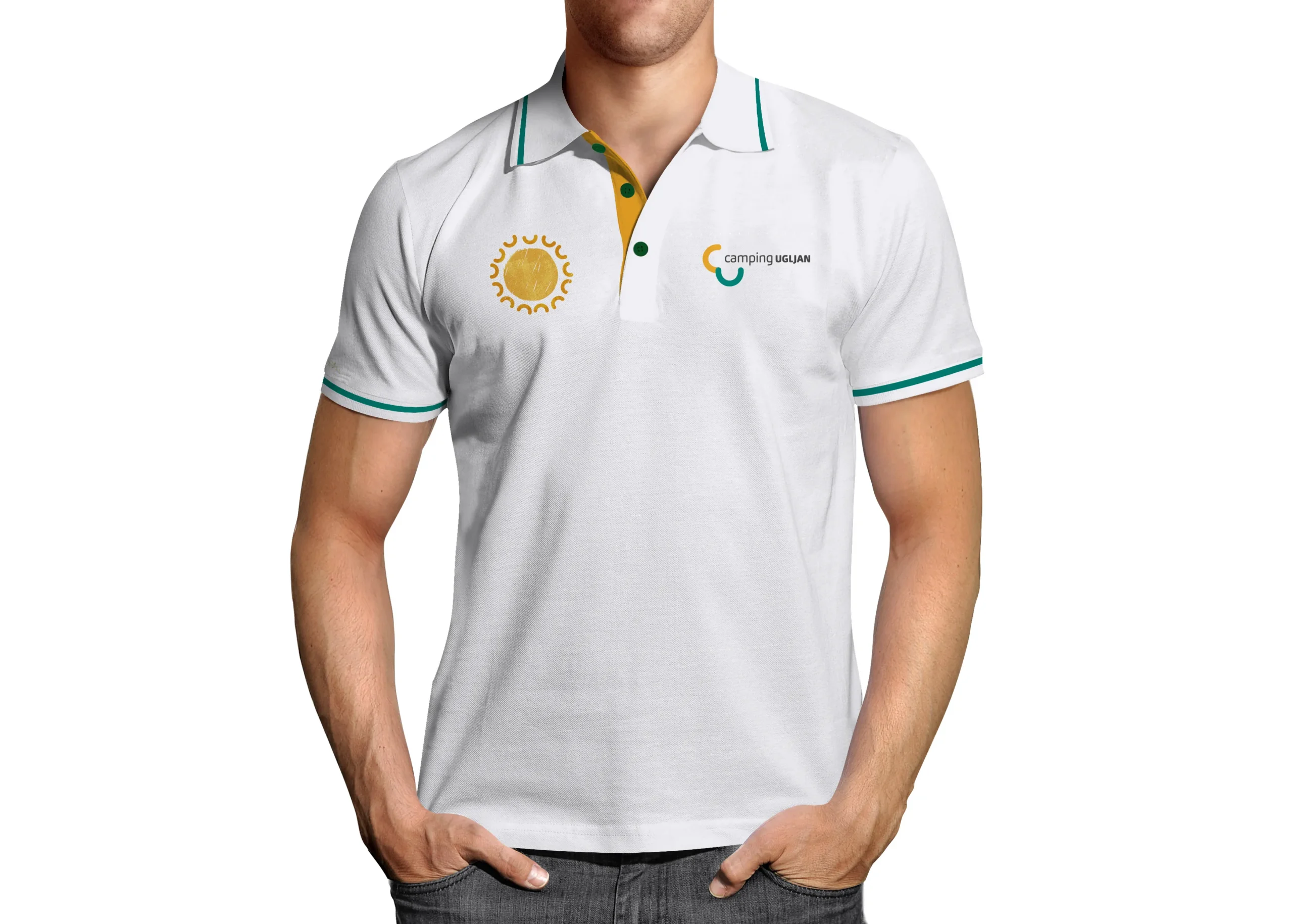
Everything started with the initials — CU. Two letters that contain three ideas at once: the camp's initials, the English pronunciation "see you," and — through maximum formal reduction — two semicircles that simultaneously read as both sun and sea. One symbol, three meanings. That became the foundation for the entire visual identity.
The tagline "Nice to see you" — or "Nice to CU" — follows naturally: it underlines the openness, accessibility, and genuine warmth that are part of the camp's character.
By multiplying and rotating the core logo elements, we developed a comprehensive system of icons, graphics, and symbols that work at every level of communication — from brand identity to practical wayfinding throughout the camp. The signage system was designed with careful attention to weather conditions, usage patterns, maintenance, and future expansion — a considered balance of aesthetics, function, and budget.
Alongside the identity and signage, we designed the camp map, printed and promotional materials, and developed and implemented both the main camp website and a separate website for the Renta Boat Ugljan service.

The Result
The camp is now widely recognisable, and guests benefit from a clearer, more comfortable experience thanks to intuitive navigation throughout the space. CU – Camping Ugljan consistently ranks among the top-rated campsites in Croatia by guests and leading travel platforms alike — one of the best and most awarded camps in the country.