BULB
Better Customer Experience
The Challenge
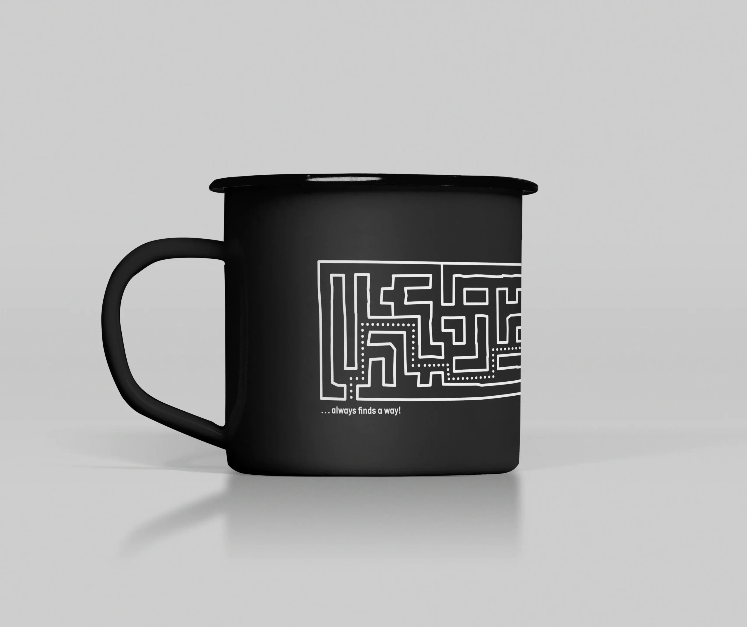
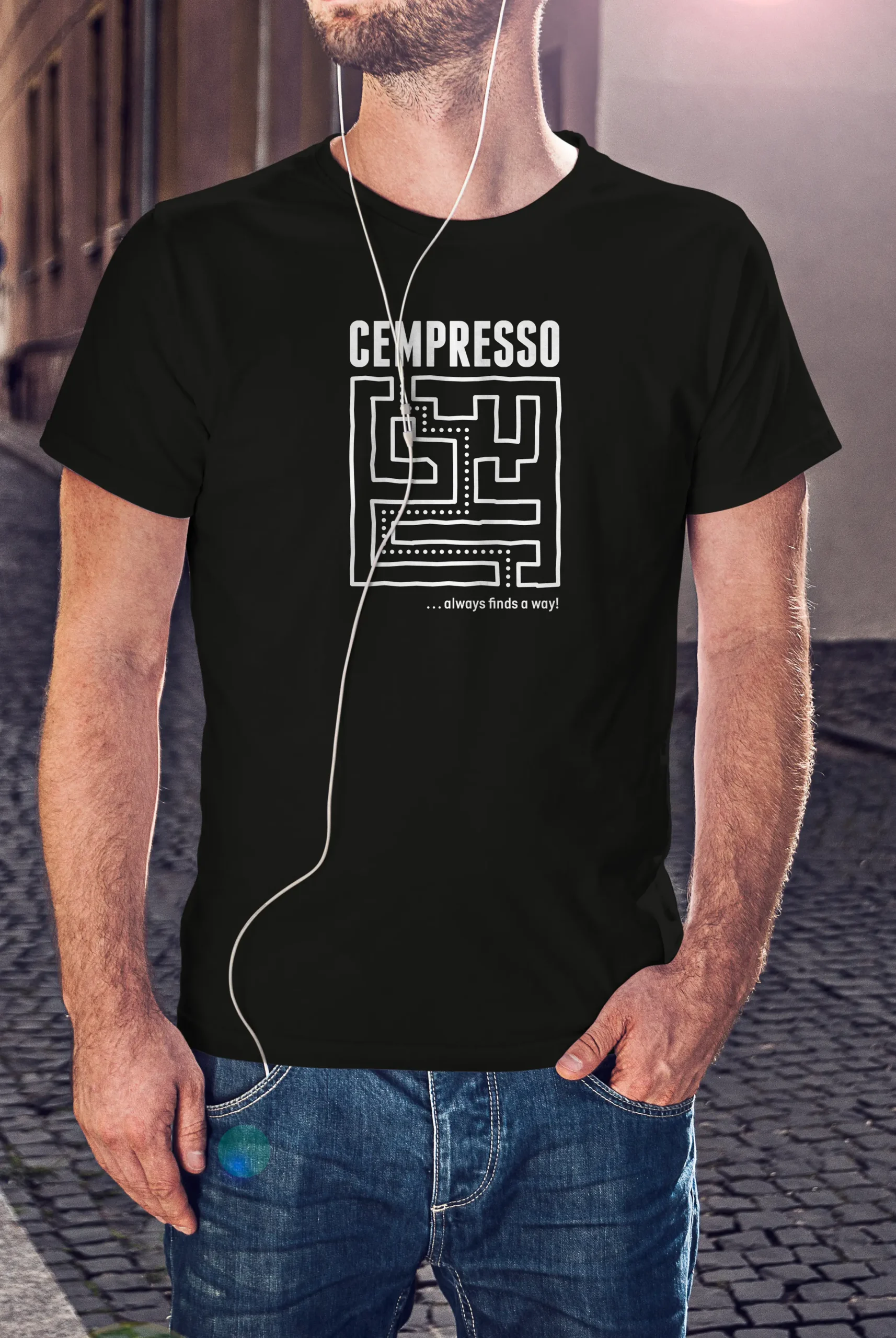
BULB Technologies is a software company specialising in the digitalisation of customer support and customer experience management — through solutions for customer-facing teams and self-service applications. As the company grew and its product portfolio expanded — including the Cempresso platform and a range of CEM (Customer Experience Management) solutions — the need arose for a visual identity that could keep pace: clearer, more flexible, and capable of communicating credibly with partners on an international stage.
Concept & Solution
The central idea was clear: present BULB Technologies as a company whose solutions are sophisticated and complex on the inside, yet simple, intuitive, and effortless to use on the outside. Technology that you don't see — but feel every day.
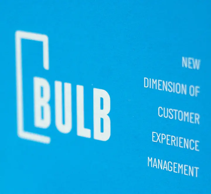
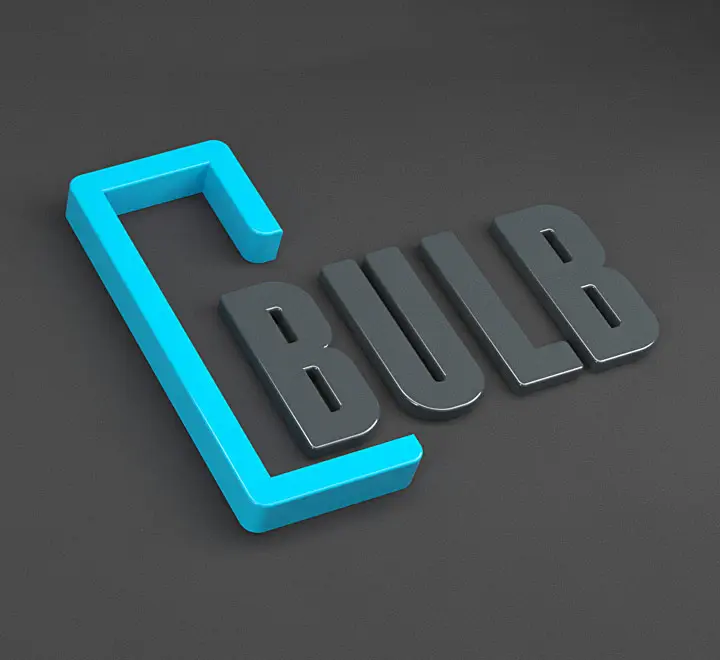
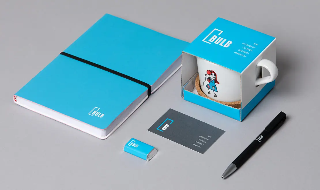
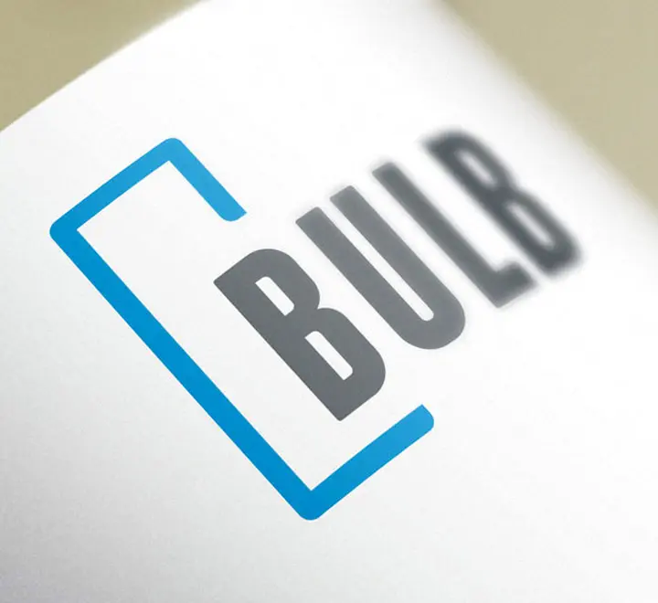
The visual answer to that idea was found in the company's own initial. The letter B in the logo breaks out of its frame — a literal visual metaphor for out-of-the-box thinking and solutions that exceed expectations. It's not merely an aesthetic choice: it's a statement about how the company approaches every challenge it takes on.
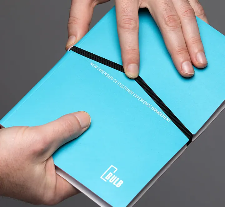
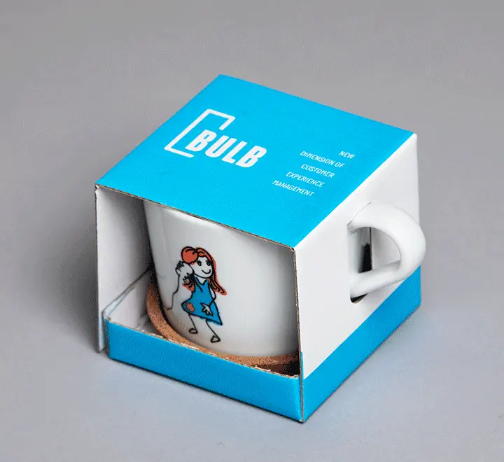
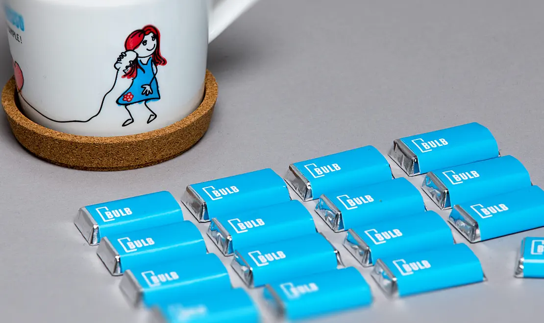
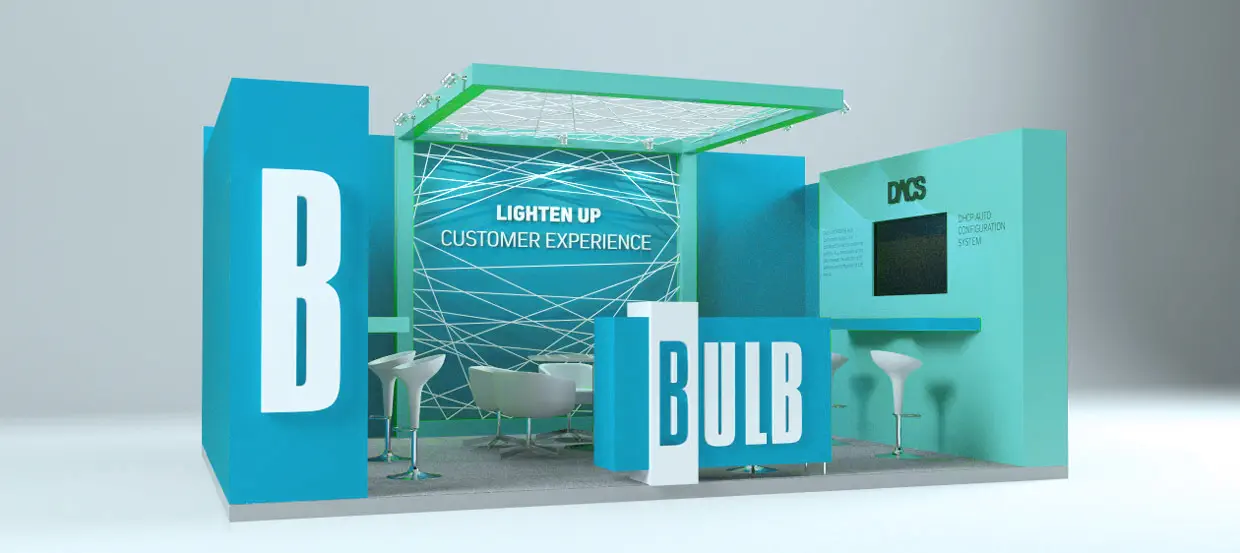
The identity was designed with a high degree of flexibility to accommodate the growth and expansion of the product portfolio — from new applications to new market segments. We developed a comprehensive graphic standards system, a range of promotional materials, interior and exterior signage, and the concept and design of an exhibition stand for appearances at international trade fairs.
The Result
A functional, clear, and consistent visual system that represents BULB Technologies as it deserves — as a technology leader serving more than forty clients across Europe, including Deutsche Telekom, A1, Telecom Italia, and United Group. An identity that grows alongside the company, without ever needing reinvention.