ANO
Insurance Brokers
The Challenge
ANO is an exclusive partner of the Aon Group — the world's leading provider of risk management services. A company of exceptional professionals and deep expertise, ANO needed a visual identity flexible enough for diverse communication needs, yet clear and consistent in reflecting its core values: competence, reliability, and a uniquely personal approach to every client.


Concept & Solution
For a company that deals in risk management, a visual identity must communicate one thing above all else: security. We approached the project with the intention of creating a visual language that is simple, solid, and bold — free from decoration that might distract from what matters.
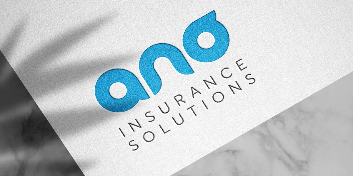
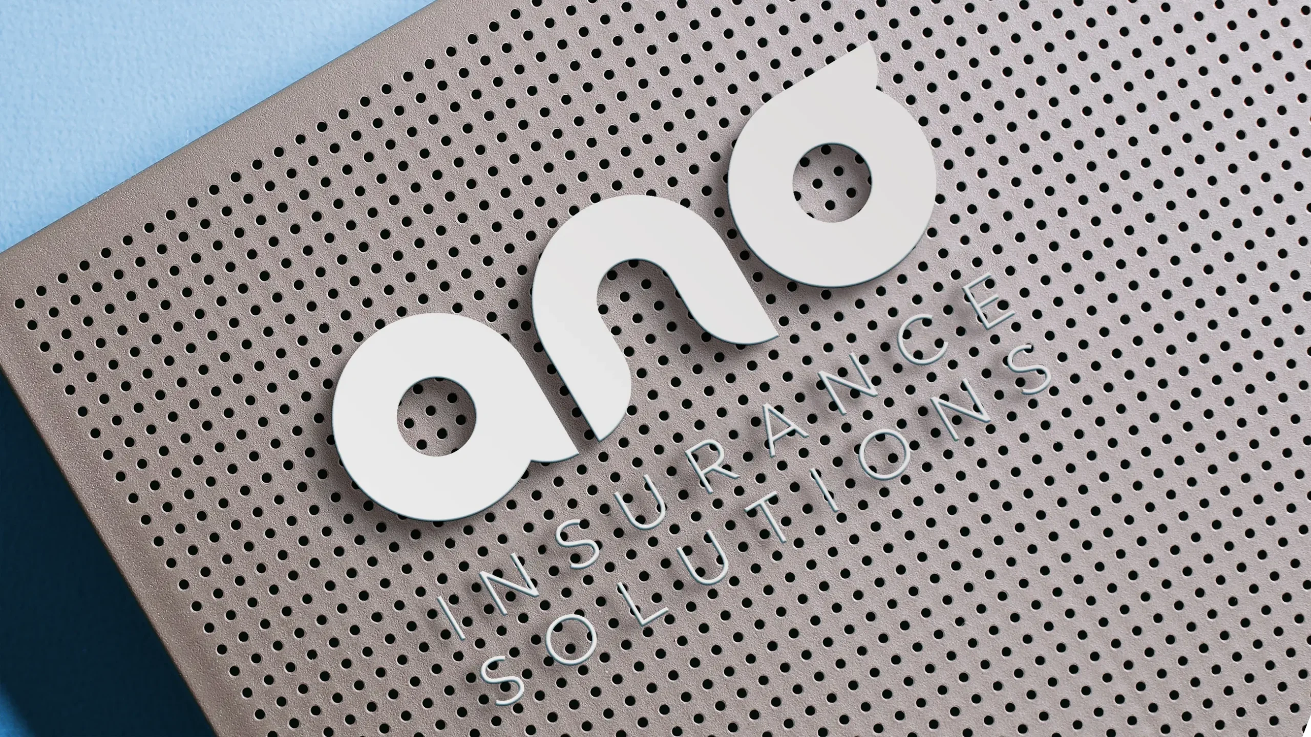
The logo is built on three circles, together symbolising professionalism, reliability, and continuous growth. A form that is both geometrically stable and conceptually clear. From the logo, we established a comprehensive graphic standards system that gives the company a strong visual foundation for every communication scenario.
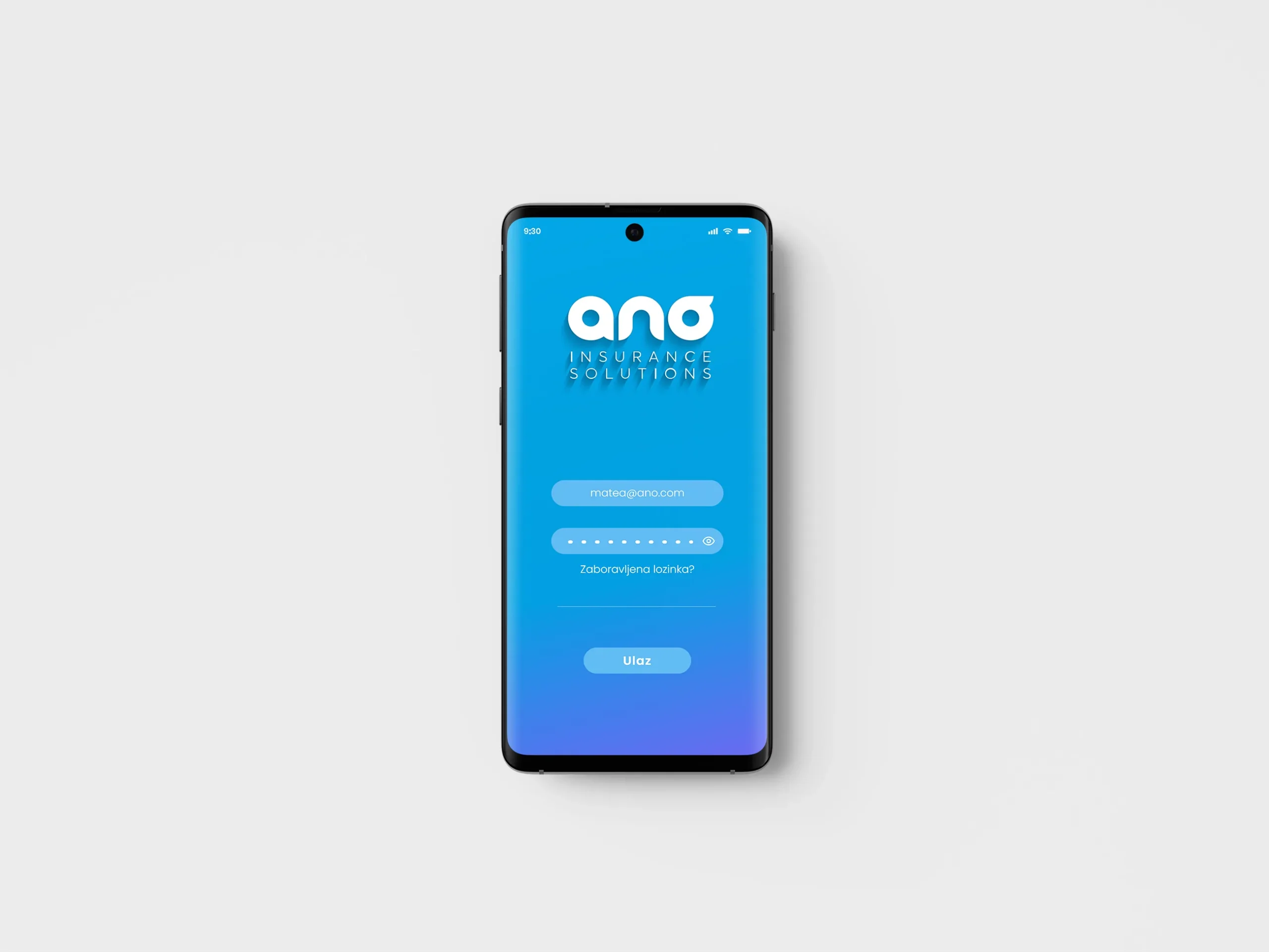
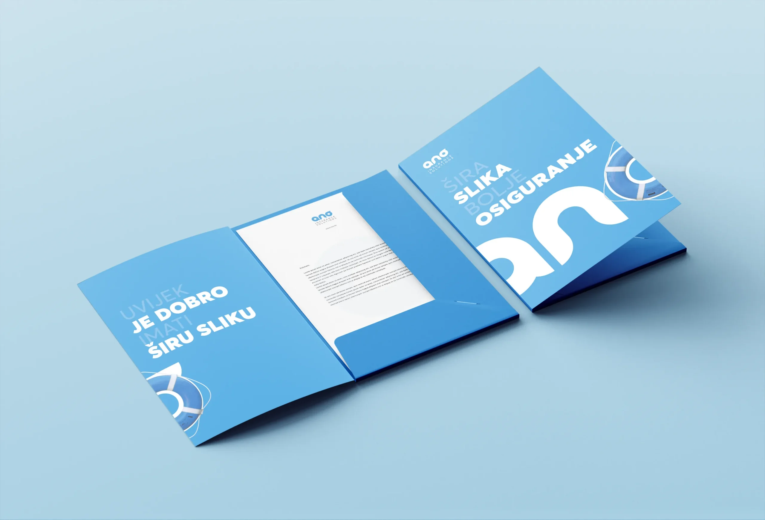
The scope of the project extended well beyond branding: we designed the website and mobile app interface, developed campaign concepts — most notably "The Bigger Picture, Better Insurance" and "Complex Times Demand Smart Solutions" — and produced corporate stationery, promotional materials, and explainer animations.

The Result
A clear, recognisable identity that adapts effortlessly to every new communication challenge — from digital channels to print. ANO is today one of the leaders in its field, and their visual identity says exactly that: serious, trustworthy, uncompromising.