CZM
Centre for Youth Health
2015
The Challenge
The Centre for Youth Health was founded with a clear mission: to create a place where young people, regardless of the nature of their health concerns, can easily and — perhaps most importantly — anonymously access professional medical support. The centre offers laboratory testing for communicable diseases alongside counselling with psychologists and psychiatrists. The challenge wasn't purely a design one — it was a communication challenge: how do you use visual language to convince young people that this is a safe, trustworthy, and welcoming place?


Concept & Solution
Young people don't respond to institutional — they respond to authentic. From the very beginning, we rejected any visual language that might make CZM feel cold or intimidating.
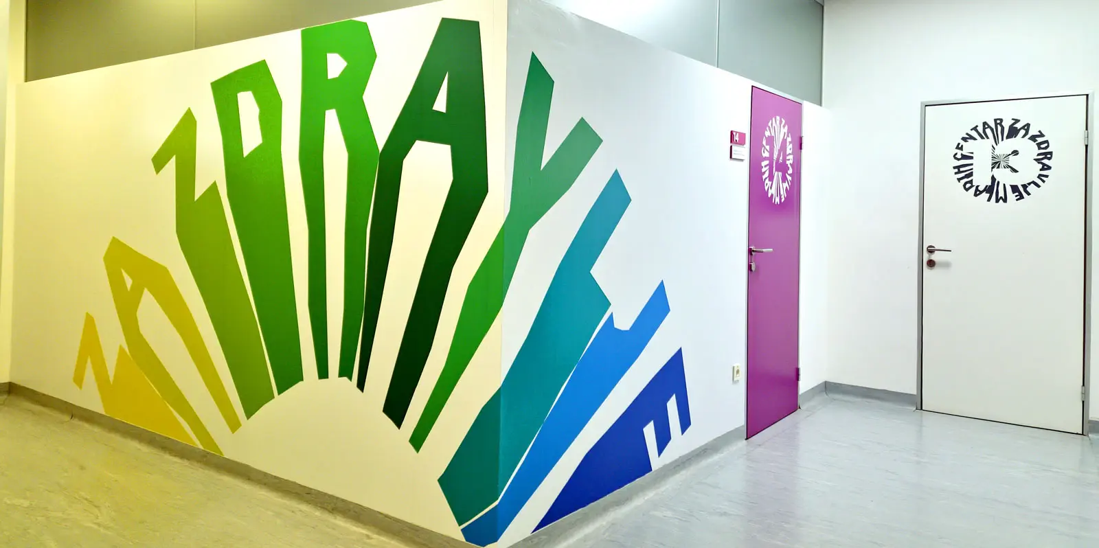
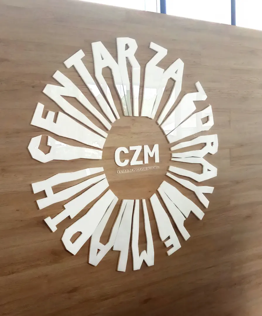
The logo is a colourful circle made up of letters that are simultaneously characters — each different, each with its own personality. The circle is a circle of friends: diverse, but together and equal. Inclusivity isn't just declared — it's visually built into the very foundation of the identity.
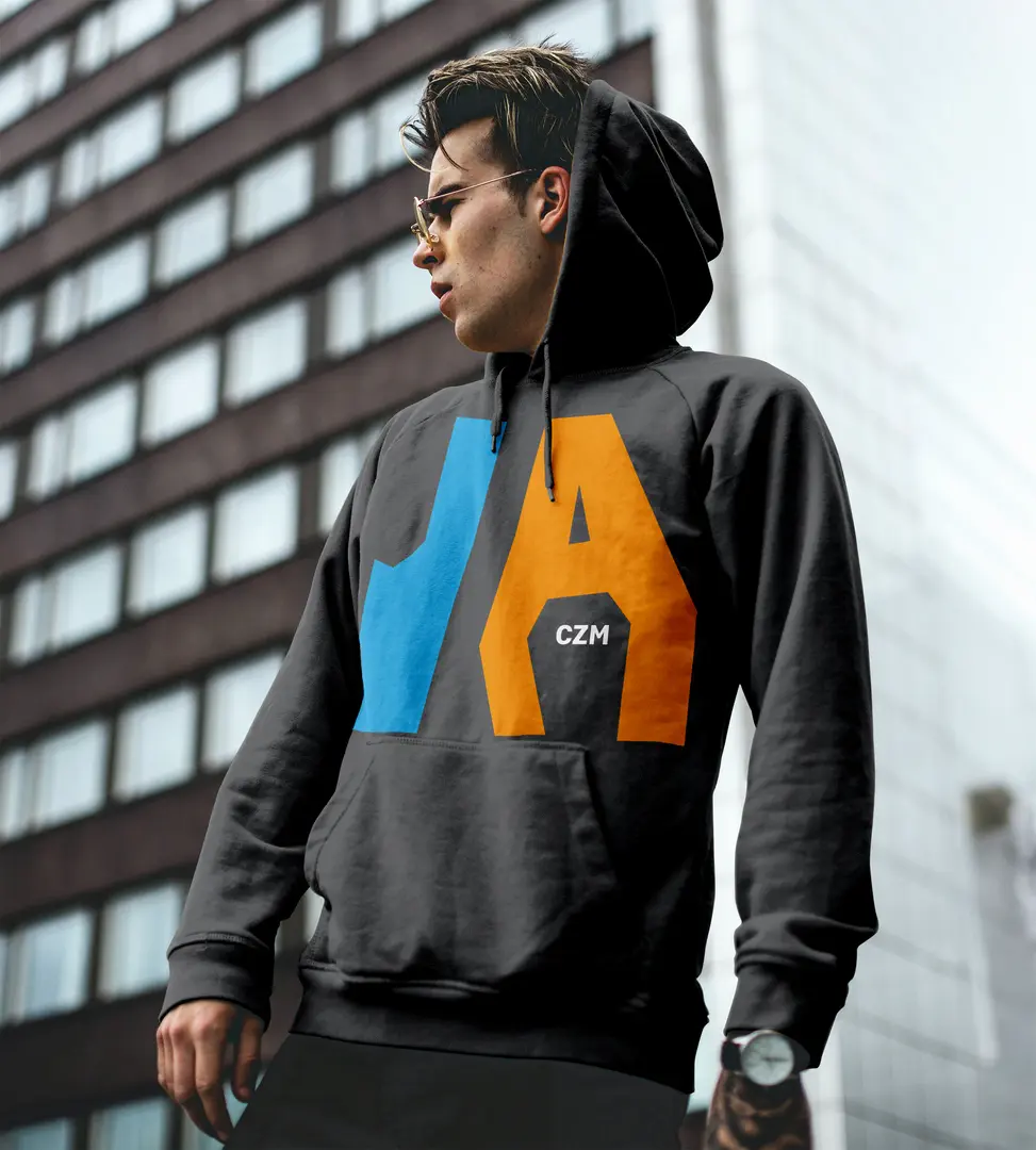
In the supporting graphics, those same letter-characters become comic-style figures that communicate, debate, and joke with each other — with mutual respect and without prejudice. A language young people understand and that doesn't alienate them.
The signage system was designed as an integral part of the interior, not an afterthought. Graphics, signs, and wayfinding work together to create a unified, cheerful, and welcoming environment — transforming a medical facility into a place where young people genuinely feel at home.

The Result
An identity that opened doors — literally. Communication between young people and medical staff improved significantly, trust in the anonymity and reliability of the service grew, and the number of young people choosing to seek help through CZM has seen continuous growth. Design that helped people — that's a result worth more than any award.