Frooty
Exciting, Fun, Cool Fruit Nectars
2020
The Challenge
Unifruit had a fruit drinks brand with real growth potential — but no clear visual system to unite its various product lines into a coherent, recognisable whole. The task was to develop a sub-brand naming system, redesign the logo, and create packaging that works on the shelf, at a party, and in someone's hand.
Concept & Solution
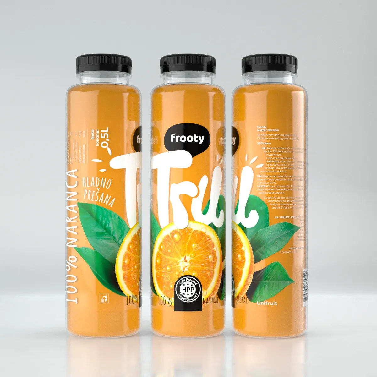
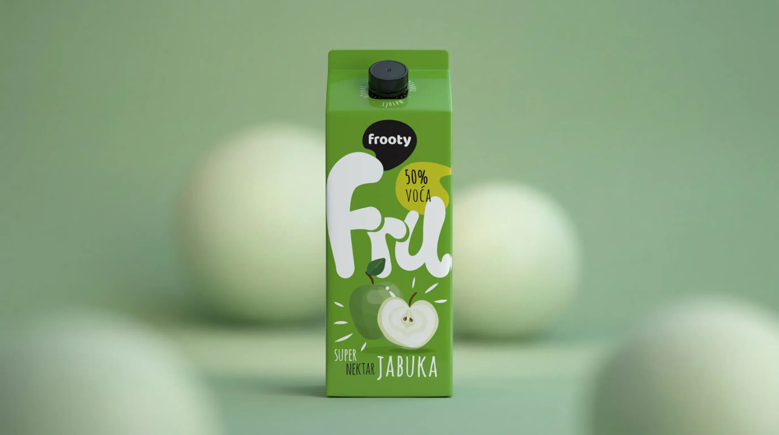
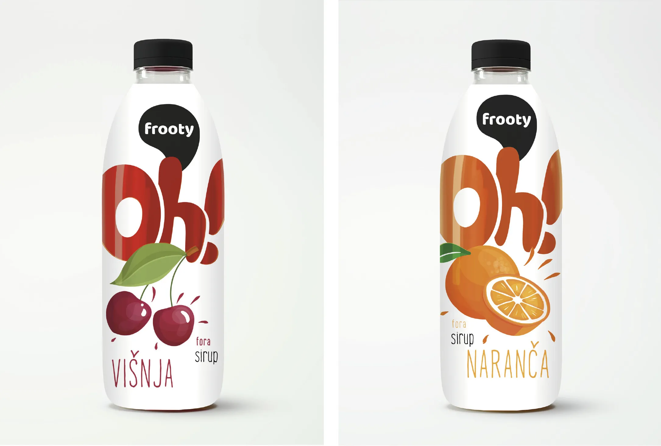
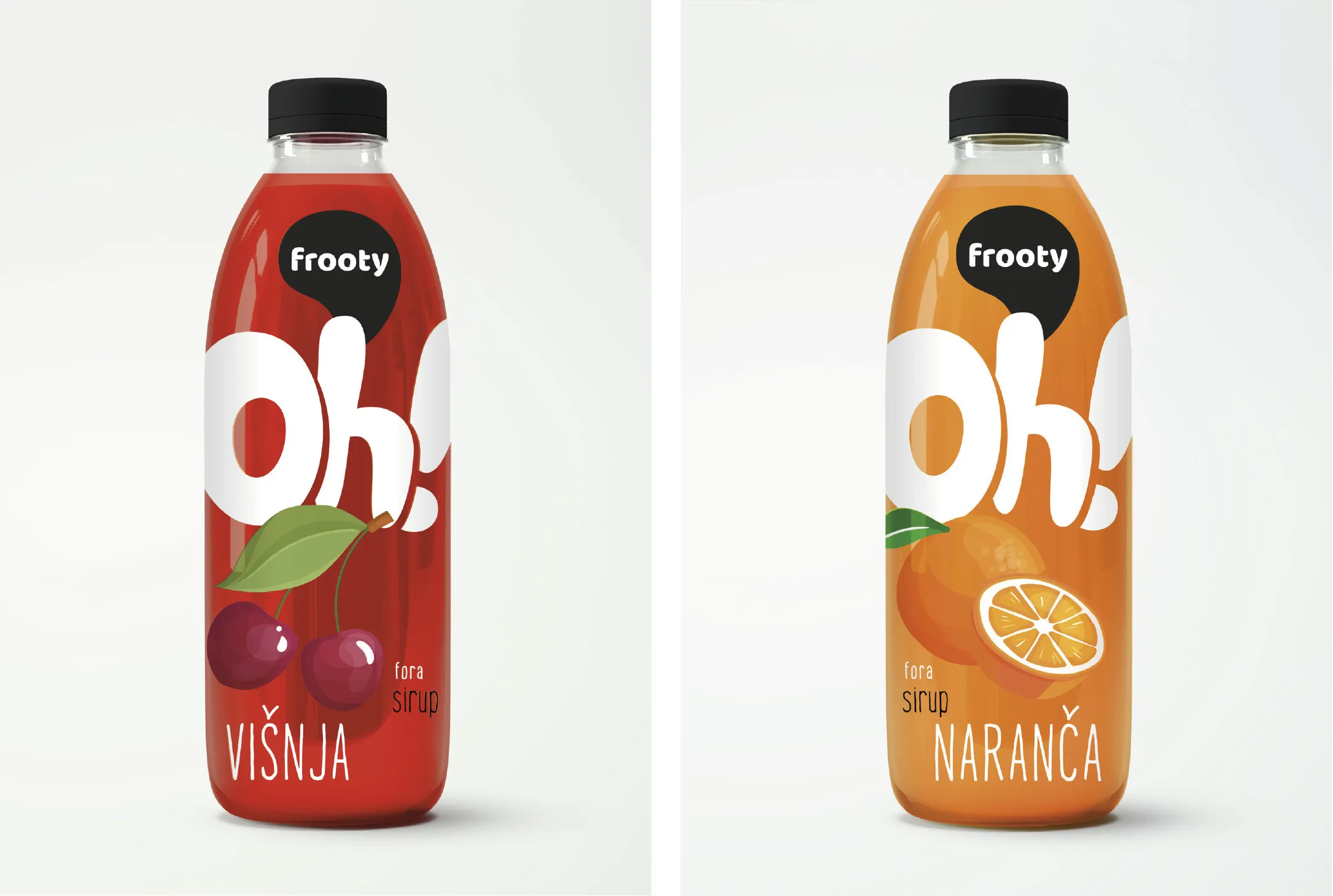
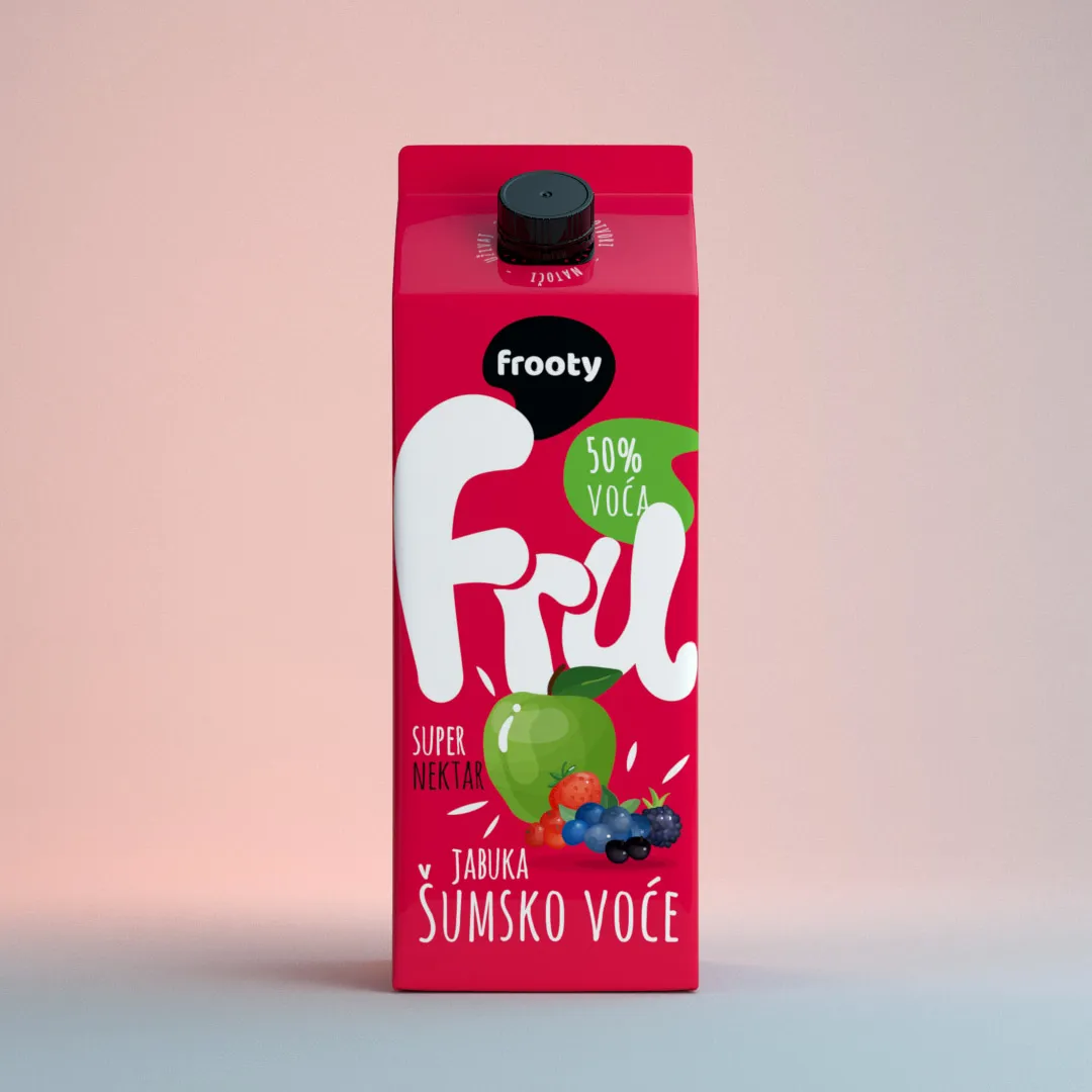
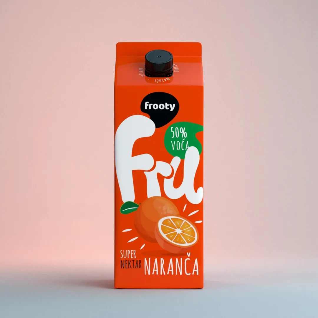
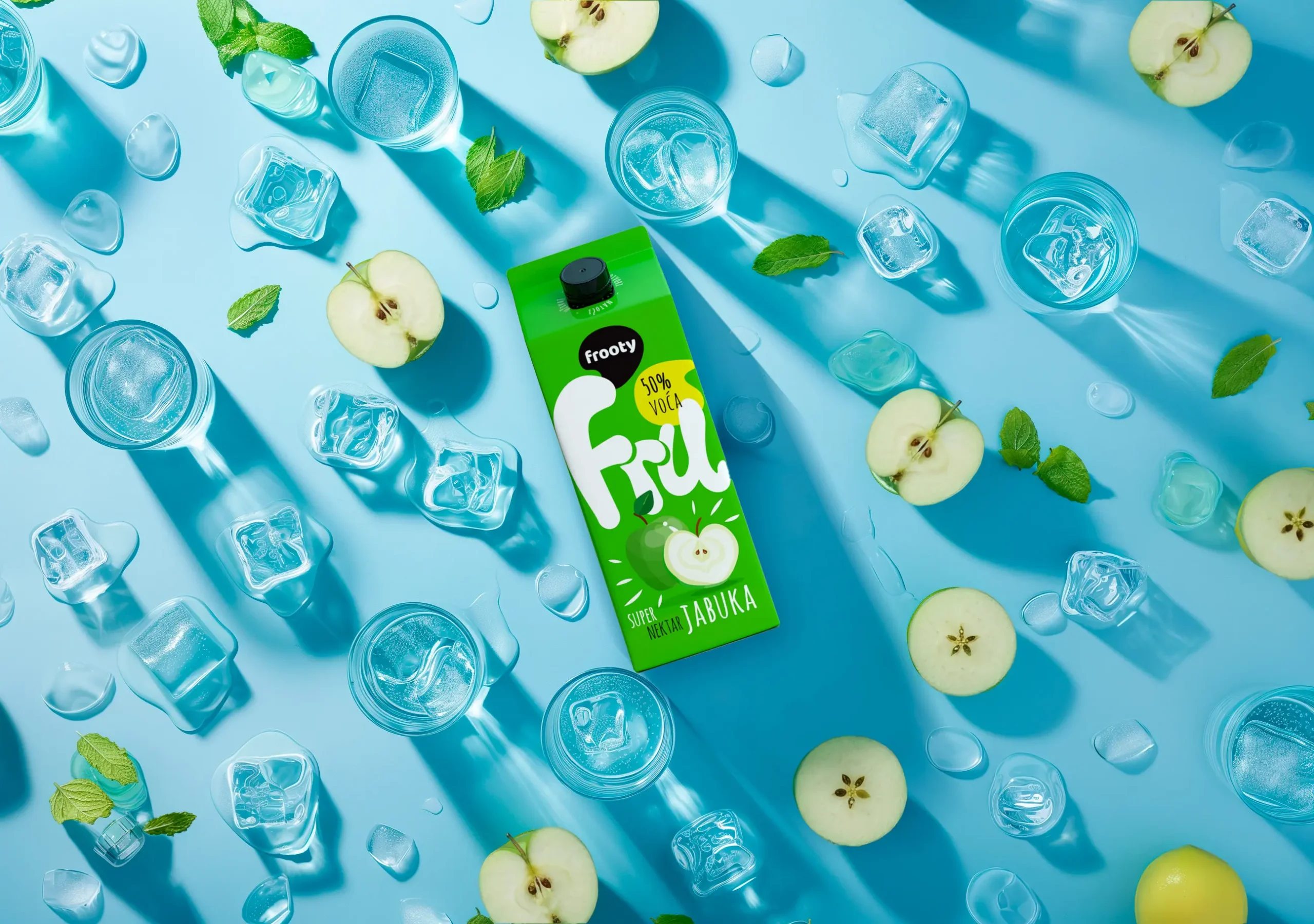
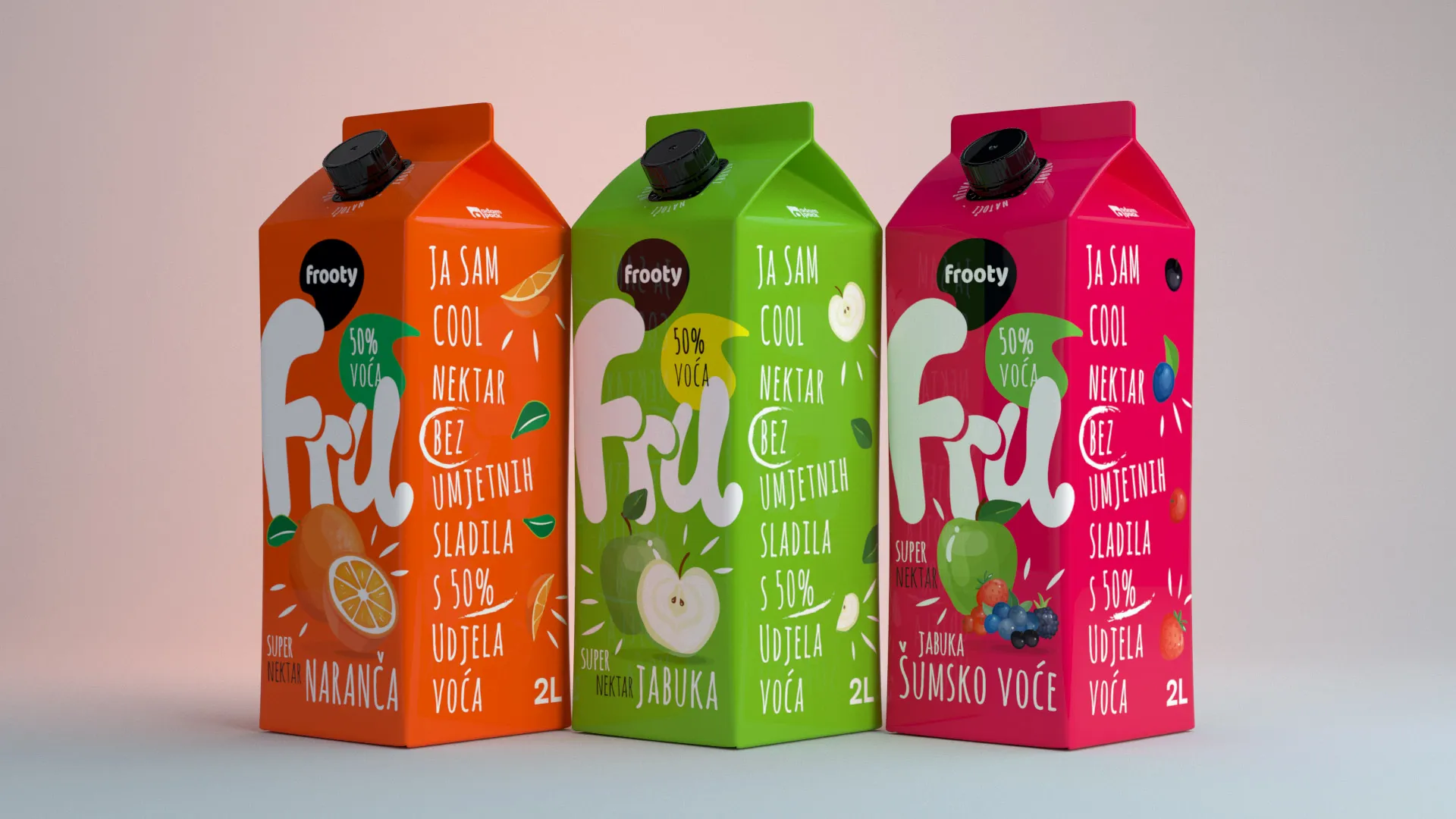
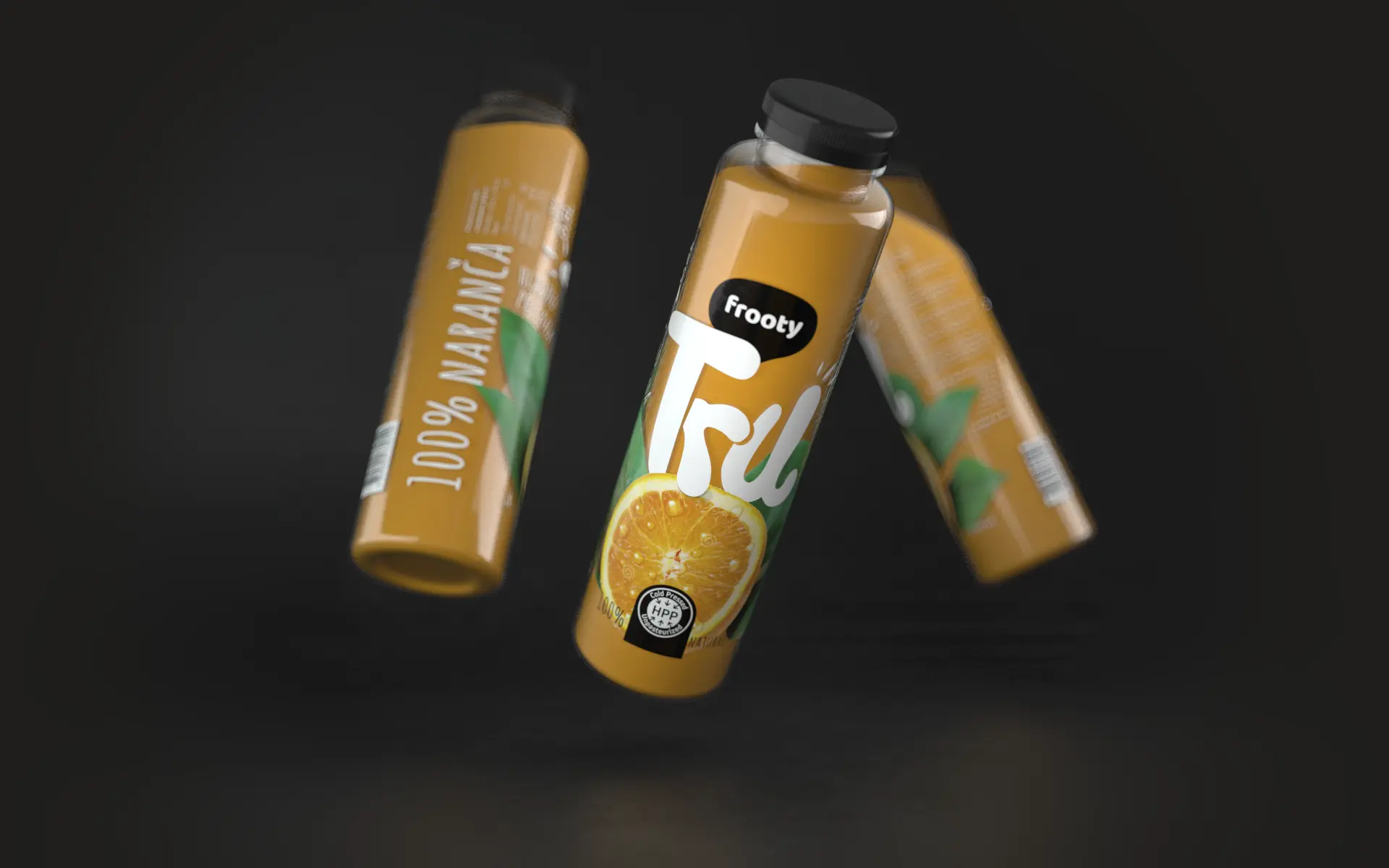
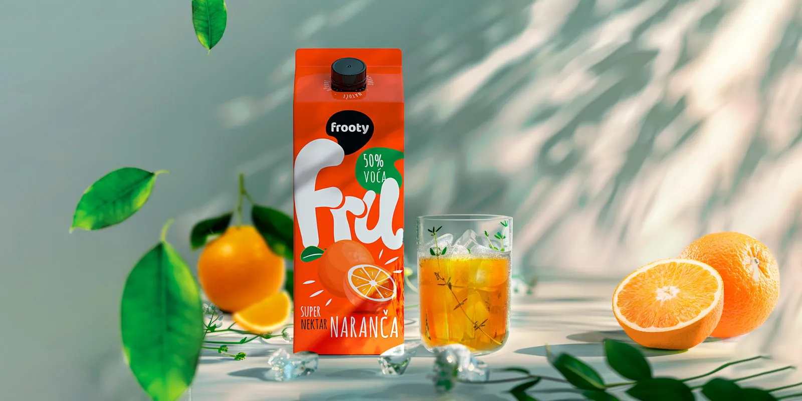
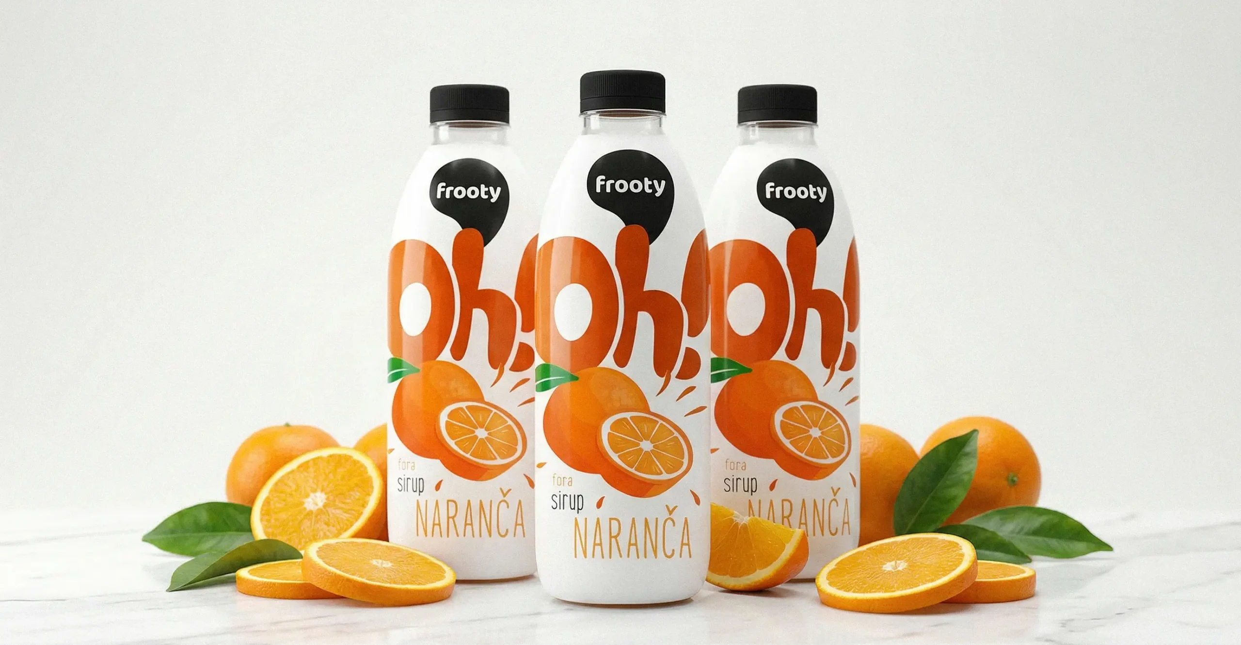
Frooty is a brand that doesn't try to be serious — and that's exactly its strength. Vivid, saturated colours inspired by real fruit in nature make each product line instantly identifiable on the shelf. Colour and packaging shape became the primary navigation system across the range.
We developed a naming system that follows the same logic — short, direct, and full of personality. Each sub-brand communicates what it is and what it feels like in a single word or exclamation: Oh! for syrups, FRU for nectars, TRU for freshly squeezed juices, ICE for iced teas, Hi! for fruit smoothies, and GO! for isotonic drinks.
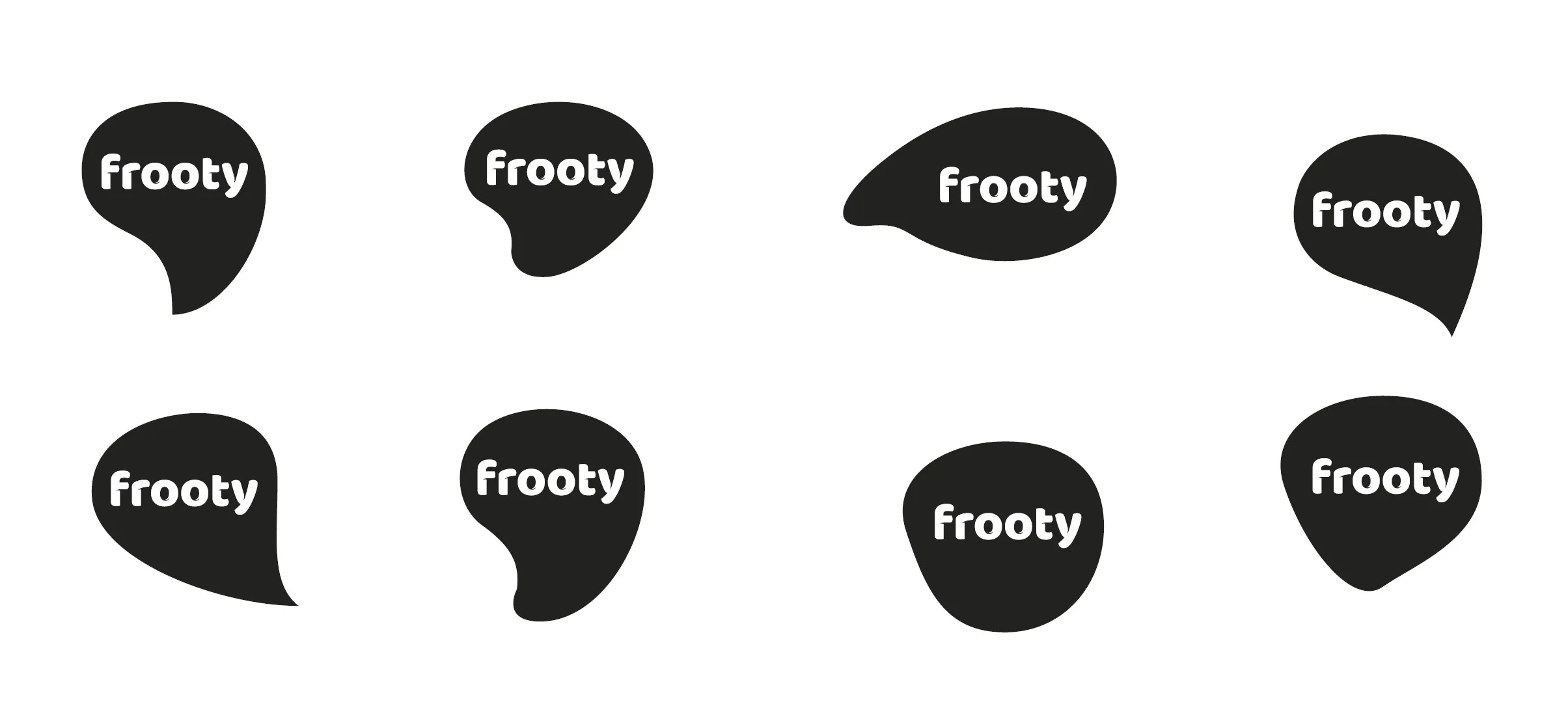
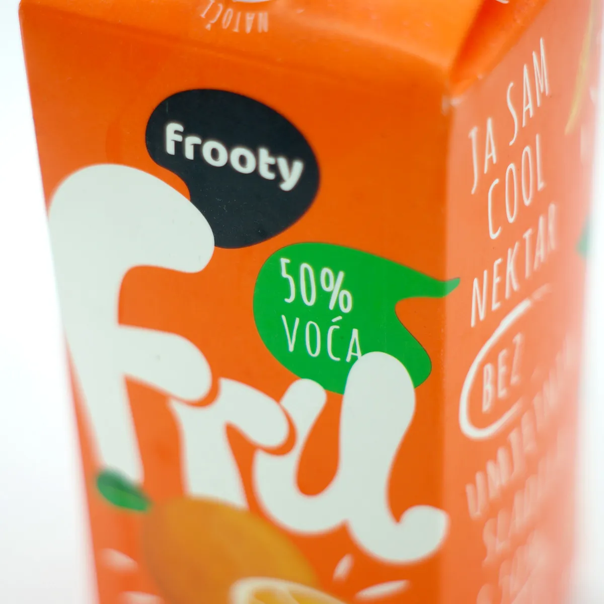
The brand logo was redesigned as a dynamic system that adapts to each product line — shifting in tone, energy, and character depending on the product type and quality tier, while always remaining unmistakably Frooty.
Alongside the packaging, we designed and implemented the unifruit.hr website to complete the brand experience in the digital space.
The Result
A colour and naming system that clearly structures a broad product range while leaving plenty of room for the brand to grow. Frooty bottles and cartons have become a welcome sight at every kind of gathering — a brand you don't need to explain, because it explains itself the moment you see it.